Plotting Adjusted Associations in R
What is a correlation?
A correlation quantifies the linear association between two variables. From one perspective, a correlation has two parts: one part quantifies the association, and the other part sets the scale of that association.
The first part—the covariance, also the correlation numerator—equates to a sort of “average sum of squares” of two variables:
\(cov_{(X, Y)} = \frac{\sum(X - \bar X)(Y - \bar Y)}{N - 1}\)
It could be easier to interpret the covariance as an “average of the X-Y matches”: Deviations of X scores above the X mean multipled by deviations of Y scores below the Y mean will be negative, and deviations of X scores above the X mean multipled by deviations of Y scores above the Y mean will be positive. More “mismatches” leads to a negative covariance and more “matches” leads to a positive covariance.
The second part—the product of the standard deviations, also the correlation denominator—restricts the association to values from -1.00 to 1.00.
\[\sqrt{var_X var_Y} = \sqrt{\frac{\sum(X - \bar X)^2}{N - 1} \frac{\sum(Y - \bar Y)^2}{N - 1}}\]
Divide the numerator by the denominator and you get a sort of “ratio of the sum of squares”, the Pearson correlation coefficient:
\[r_{XY} = \frac{\frac{\sum(X - \bar X)(Y - \bar Y)}{N - 1}}{\sqrt{\frac{\sum(X - \bar X)^2}{N - 1} \frac{\sum(Y - \bar Y)^2}{N - 1}}} = \frac{cov_{(X, Y)}}{\sqrt{var_X var_Y}}\]
Square this “standardized covariance” for an estimate of the proportion of variance of Y that can be accounted for by a linear function of X, \[R^2_{XY}\].
By the way, the correlation equation is very similar to the bivariate linear regression beta coefficient equation. The only difference is in the denominator which excludes the Y variance:
\[\hat{\beta} = \frac{\frac{\sum(X - \bar X)(Y - \bar Y)}{N - 1}}{\sqrt{\frac{\sum(X - \bar X)^2}{N - 1} }} = \frac{cov_{(X, Y)}}{\sqrt{var_X}}\]
What does it mean to “adjust” a correlation?
An adjusted correlation refers to the (square root of the) change in a regression model’s \(R^2\) after adding a single predictor to the model: \(R^2_{full} - R^2_{reduced}\). This change quantifies that additional predictor’s “unique” contribution to observed variance explained. Put another way, this value quantifies observed variance in Y explained by a linear function of X after removing variance shared between X and the other predictors in the model.
Model and Conceptual Assumptions for Linear Regression
- Correct functional form. Your model variables share linear relationships.
- No omitted influences. This one is hard: Your model accounts for all relevant influences on the variables included. All models are wrong, but how wrong is yours?
- Accurate measurement. Your measurements are valid and reliable. Note that unreliable measures can’t be valid, and reliable measures don’t necessairly measure just one construct or even your construct.
- Well-behaved residuals. Residuals (i.e., prediction errors) aren’t correlated with predictor variables or eachother, and residuals have constant variance across values of your predictor variables.
Libraries
# library("tidyverse")
# library("knitr")
# library("effects")
# library("psych")
# library("candisc")

library(tidyverse)
library(knitr)
library(effects)
library(psych)
library(candisc)

# select from dplyr
select <- dplyr::select
recode <- dplyr::recode
Load data
From
help("HSB"): “The High School and Beyond Project was a longitudinal study of students in the U.S. carried out in 1980 by the National Center for Education Statistics. Data were collected from 58,270 high school students (28,240 seniors and 30,030 sophomores) and 1,015 secondary schools. The HSB data frame is sample of 600 observations, of unknown characteristics, originally taken from Tatsuoka (1988).”
HSB <- as_tibble(HSB)

# print a random subset of rows from the dataset
HSB %>% sample_n(size = 15) %>% kable()| id | gender | race | ses | sch | prog | locus | concept | mot | career | read | write | math | sci | ss |
|---|---|---|---|---|---|---|---|---|---|---|---|---|---|---|
| 88 | female | asian | high | public | academic | -0.39 | 1.19 | 1.00 | prof1 | 40.5 | 59.3 | 41.9 | 33.6 | 50.6 |
| 113 | male | african-amer | high | public | academic | -0.03 | 0.87 | 1.00 | military | 53.2 | 46.3 | 43.0 | 41.7 | 50.6 |
| 515 | male | white | middle | public | academic | 0.68 | -0.26 | 1.00 | prof2 | 62.7 | 61.9 | 56.2 | 47.1 | 45.6 |
| 141 | male | african-amer | middle | public | vocation | -2.23 | 1.19 | 1.00 | operative | 36.3 | 38.5 | 39.3 | 39.0 | 45.6 |
| 439 | female | white | low | public | academic | 0.68 | 0.88 | 1.00 | prof1 | 46.9 | 61.9 | 53.0 | 52.6 | 60.5 |
| 514 | male | white | middle | public | academic | 0.06 | 0.03 | 0.00 | proprietor | 46.9 | 51.5 | 57.2 | 52.6 | 60.5 |
| 207 | female | white | middle | public | general | 1.11 | 0.90 | 0.33 | homemaker | 55.3 | 50.2 | 41.7 | 58.5 | 55.6 |
| 353 | male | white | middle | public | academic | -0.21 | -1.13 | 0.00 | craftsman | 38.9 | 41.1 | 43.6 | 55.3 | 45.6 |
| 219 | female | white | middle | public | vocation | 0.10 | 0.03 | 0.33 | manager | 49.5 | 56.7 | 48.0 | 47.1 | 60.5 |
| 169 | female | white | middle | public | academic | 1.16 | 1.19 | 1.00 | prof2 | 70.7 | 64.5 | 72.2 | 66.1 | 55.6 |
| 501 | male | white | middle | public | academic | 0.91 | 0.59 | 1.00 | prof2 | 65.4 | 67.1 | 67.1 | 66.1 | 61.8 |
| 150 | female | african-amer | middle | public | academic | 0.91 | -0.28 | 1.00 | military | 60.1 | 67.1 | 56.2 | 37.4 | 50.6 |
| 376 | male | white | middle | public | general | -1.33 | 0.03 | 0.67 | craftsman | 41.6 | 30.7 | 56.9 | 47.1 | 50.6 |
| 63 | female | hispanic | low | public | general | -0.34 | 0.59 | 1.00 | military | 38.9 | 33.9 | 35.1 | 44.4 | 40.6 |
| 568 | female | white | middle | private | academic | 0.00 | 0.34 | 0.33 | prof1 | 46.9 | 59.3 | 53.7 | 58.0 | 45.6 |
Do students who score higher on a standardized math test tend to score higher on a standardized science test?
Scatterplot
alphabelow refers to the points’ transparency (0.5 = 50%),lmrefers to linear model andserefers to standard error bands
HSB %>%
  ggplot(mapping = aes(x = math, y = sci)) +
  geom_point(alpha = 0.5) +
  geom_smooth(method = "lm", se = FALSE, color = "red")
Center the standardized math scores
If the standardized math scores are centered around their mean (i.e., 0 = mean), then we can interpret the regression intercept—x = 0 when the regression line crosses the y-axis—as the grand mean standardized science score.
HSB <- HSB %>% mutate(math_c = math - mean(math, na.rm = TRUE))Fit linear regression model
scimath1 <- lm(sci ~ math_c, data = HSB)Summarize model
summary(scimath1)##
## Call:
## lm(formula = sci ~ math_c, data = HSB)
##
## Residuals:
## Min 1Q Median 3Q Max
## -20.7752 -4.8505 0.3355 5.1096 25.4184
##
## Coefficients:
## Estimate Std. Error t value Pr(>|t|)
## (Intercept) 51.76333 0.30154 171.66 <2e-16 ***
## math_c 0.66963 0.03206 20.89 <2e-16 ***
## ---
## Signif. codes: 0 '***' 0.001 '**' 0.01 '*' 0.05 '.' 0.1 ' ' 1
##
## Residual standard error: 7.386 on 598 degrees of freedom
## Multiple R-squared: 0.4219, Adjusted R-squared: 0.4209
## F-statistic: 436.4 on 1 and 598 DF, p-value: < 2.2e-16# print the standardized science score descriptive statistics
HSB %>% pull(sci) %>% describe()## vars n mean sd median trimmed mad min max range skew kurtosis
## X1 1 600 51.76 9.71 52.6 51.93 12.01 26 74.2 48.2 -0.16 -0.7
## se
## X1 0.4Interpretation
On average, students scored 51.76 points (SD = 9.71 points) on the standardized science test. However, for every one more point students scored on the standardized math test, they scored 0.67 more points (SE = 0.03) on the standardized science test, t(598) = 20.89, p < .001.
If we account for the fact that students who score higher on a standardized math test also tend to score higher on a standardized reading test, do students who score higher on the standardized math test still tend to score higher on the standardized science test?
Center the standardized reading scores
Same explanation as above: Because the regression line crosses the y-axis when the predictors’ axes = 0, transforming those predictors so that 0 reflects their means allows us to interpret the regression intercept as the grand mean standardized science score.
HSB <- HSB %>% mutate(read_c = read - mean(read, na.rm = TRUE))Fit linear regression model
scimath2 <- lm(sci ~ math_c + read_c, data = HSB)Summarize model
summary(scimath2)##
## Call:
## lm(formula = sci ~ math_c + read_c, data = HSB)
##
## Residuals:
## Min 1Q Median 3Q Max
## -19.5139 -4.5883 0.0933 4.5700 22.4739
##
## Coefficients:
## Estimate Std. Error t value Pr(>|t|)
## (Intercept) 51.76333 0.26995 191.754 <2e-16 ***
## math_c 0.34524 0.03910 8.829 <2e-16 ***
## read_c 0.44503 0.03644 12.213 <2e-16 ***
## ---
## Signif. codes: 0 '***' 0.001 '**' 0.01 '*' 0.05 '.' 0.1 ' ' 1
##
## Residual standard error: 6.612 on 597 degrees of freedom
## Multiple R-squared: 0.5375, Adjusted R-squared: 0.5359
## F-statistic: 346.8 on 2 and 597 DF, p-value: < 2.2e-16Compute \(R^2\) change and compare models
# adjusted R-squared is an unbiased estimate of R-squared
summary(scimath2)$adj.r.squared - summary(scimath1)$adj.r.squared
## [1] 0.114985# compare models
anova(scimath1, scimath2)## Analysis of Variance Table
##
## Model 1: sci ~ math_c
## Model 2: sci ~ math_c + read_c
## Res.Df RSS Df Sum of Sq F Pr(>F)
## 1 598 32624
## 2 597 26102 1 6521.7 149.16 < 2.2e-16 ***
## ---
## Signif. codes: 0 '***' 0.001 '**' 0.01 '*' 0.05 '.' 0.1 ' ' 1Save both model predictions in tables
Below, I use the
effect()function to estimate predicted standardized science scores across a range of unique values of standardized math scores; for scimath2, the full model, the predicted scores have been purged of the linear effect of standardized reading scores. I transform the result fromeffect()into atibbledata.frame, which includes predicted values (fitted values), predictor values, standard errors of the predictions, and upper and lower confidence limits for the predictions. I can use this table to create a regression line and confidence bands in a plot.
(scimath_predtable1 <- effect(term = "math_c", mod = scimath1) %>% as_tibble())## # A tibble: 5 x 5
## math_c fit se lower upper
## <dbl> <dbl> <dbl> <dbl> <dbl>
## 1 -20 38.4 0.708 37.0 39.8
## 2 -9 45.7 0.417 44.9 46.6
## 3 2 53.1 0.308 52.5 53.7
## 4 10 58.5 0.440 57.6 59.3
## 5 20 65.2 0.708 63.8 66.5(scimath_predtable2 <- effect(term = "math_c", mod = scimath2) %>% as_tibble())## # A tibble: 5 x 5
## math_c fit se lower upper
## <dbl> <dbl> <dbl> <dbl> <dbl>
## 1 -20 44.9 0.827 43.2 46.5
## 2 -9 48.7 0.444 47.8 49.5
## 3 2 52.5 0.281 51.9 53.0
## 4 10 55.2 0.475 54.3 56.1
## 5 20 58.7 0.827 57.0 60.3Plot adjusted relationship
Below, I create the lines and the confidence “ribbons” from the tables I created above. The points come from the original
data.framethough. Follow the code line by line:geom_pointuses the HSB data, and bothgeom_lines use data from different tables of predicted values. In other words, layers of lines and ribbons are added on top of the layer of points.
HSB %>%
  ggplot(mapping = aes(x = math_c, y = sci)) +
  geom_point(alpha = 0.5) +
  geom_line(data = scimath_predtable1, mapping = aes(x = math_c, y = fit), color = "red") +
  geom_line(data = scimath_predtable2, mapping = aes(x = math_c, y = fit), color = "blue") +
  geom_ribbon(data = scimath_predtable2, mapping = aes(x = math_c, y = fit, ymin = lower, ymax = upper), fill = "blue", alpha = 0.25) +
  labs(x = "Standardized math score (grand mean centered)", y = "Standardized science score")
## Warning: Ignoring unknown aesthetics: y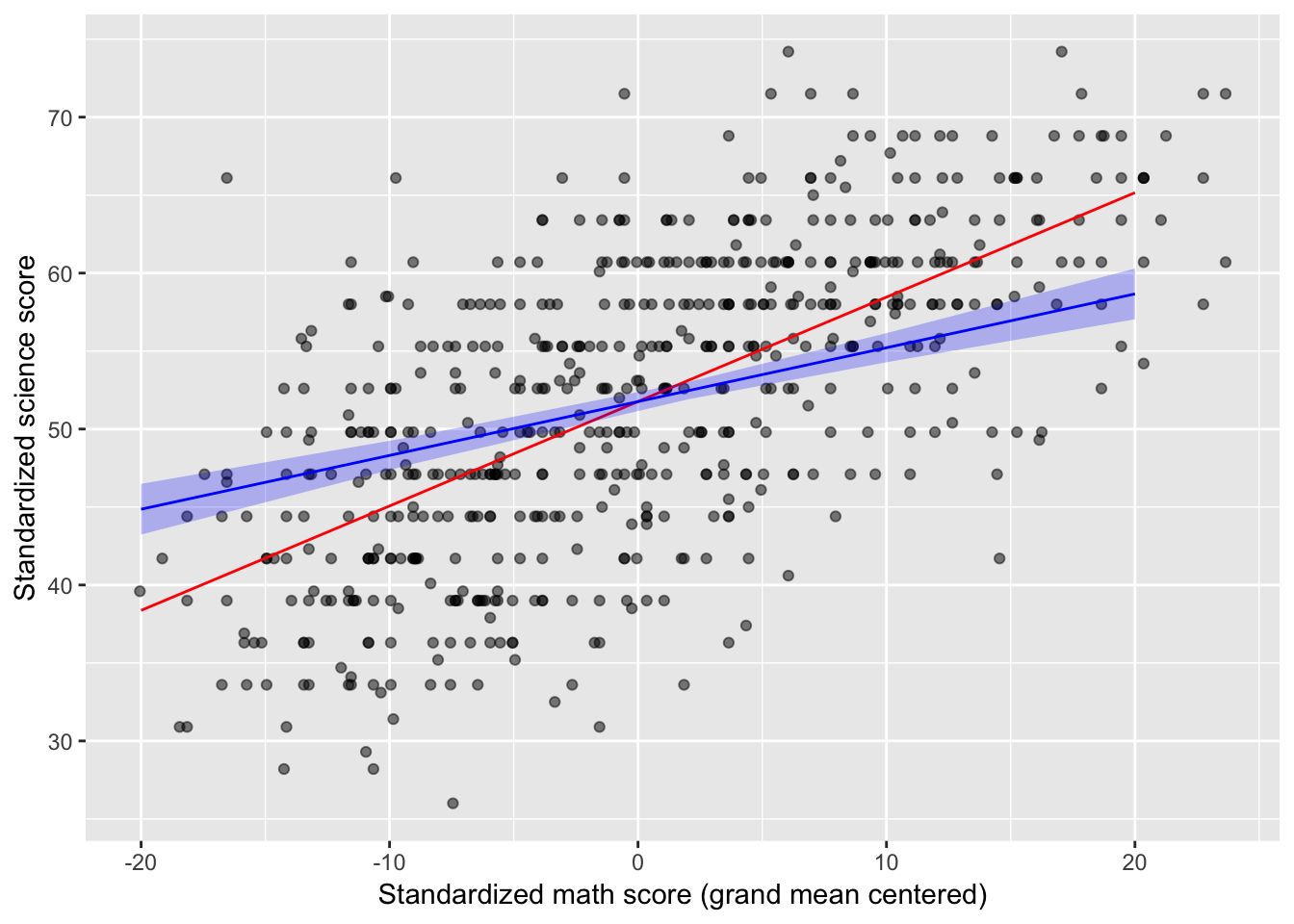
Interpretation
After partialling out variance shared between standardized math and reading scores, for every one more point students scored on the standardized math test, they scored 0.35 more points (SE = 0.04) on the standardized science test, t(597) = 12.21, p < .001. Importantly, the model that includes standardized reading scores explained 53.60% of the observed variance in standardized science scores, an 11.50% improvement over the model that included only standardized math scores.
Resources
- Cohen, J., Cohen, P., West, S. G., & Aiken, L. S. (2003). Applied multiple regression/correlation analysis for the behavioral sciences. New York, NY: Routledge.
- Gonzalez, R. (December, 2016). Lecture Notes #8: Advanced Regression Techniques I Retreived from http://www-personal.umich.edu/~gonzo/coursenotes/file8.pdf on June 28th, 2018.
- MacKinnon, D. P. (2008). Introduction to statistical mediation analysis. New York, NY: Lawrence Erlbaum Associates.
General word of caution
Above, I listed resources prepared by experts on these and related topics. Although I generally do my best to write accurate posts, don’t assume my posts are 100% accurate or that they apply to your data or research questions. Trust statistics and methodology experts, not blog posts.
Nicholas M. Michalak
Data Scientist | Ph.D. Social Psychology
I study how both modern and evolutionarily-relevant threats affect how people perceive themselves and others.