Probing and Plotting Interactions in R
What is moderation?
Moderation refers to how some variable modifies the direction or the strength of the association between two variables. In other words, a moderator variable qualifies the relation between two variables. A moderator is not a part of some proposed causal process; instead, it interacts with the relation between two variables in such a way that their relation is stronger, weaker, or opposite in direction—depending on values of the moderator. For example, as room temperature increases, people may report feeling thirstier. But that may depend on how physically fit people are. Maybe physically fit people don’t report feeling thirsty as room temperature increases, or maybe physically fit people—compared to less physically fit people—have a higher room temperature threshold at which they start feeling thirstier. In this example, the product of one predictor variable and the moderator—their interaction—quantifies the moderator’s effect. Statistically, the product term accounts for variability in thirst or water drinking independently of either predictor variable by itself.
What is a simple slope?
In a 2-way interaction, a simple slope represents the relation between two variables (e.g., x and y) at a specific value of a third variable (e.g., a moderator variable). In this sense, a simple slope is a conditional relationship between two variables. For example, if participants are physically fit, then as room temperature increases, thirst also increases.
Model and Conceptual Assumptions
- Correct functional form. Your model variables share linear relationships.
- No omitted influences. This one is hard: Your model accounts for all relevant influences on the variables included. All models are wrong, but how wrong is yours?
- Accurate measurement. Your measurements are valid and reliable. Note that unreliable measures can’t be valid, and reliable measures don’t necessairly measure just one construct or even your construct.
- Well-behaved residuals. Residuals (i.e., prediction errors) aren’t correlated with predictor variables or eachother, and residuals have constant variance across values of your predictor variables.
Libraries
library(tidyverse)
library(knitr)
library(psych)
library(effects)
library(multcomp)

# In the code belo,w I want select from the dplyr package from the tidyverse
select <- dplyr::select
Data: Example 1 (categorical x continuous interaction)
I combined the data from Table 3.1 in Mackinnon (2008, p. 56) [mackinnon_2008_t3.1.csv] with those from Table 10.1 in Mackinnon (2008, p. 291) [mackinnon_2008_t10.1.csv]
thirst_norm <- read_csv("https://github.com/nmmichalak/academic-kickstart/raw/master/static/post/2019-02-14-testing-conditional-indirect-effects-mediation-in-r/2019-02-14-testing-conditional-indirect-effects-mediation-in-r_files/data/mackinnon_2008_t3.1.csv")
thirst_fit <- read_csv("https://github.com/nmmichalak/academic-kickstart/raw/master/static/post/2019-02-13-testing-indirect-effects-mediation-in-r/data/mackinnon_2008_t10.1.csv")
Code new IDs for fit data
thirst_fit$id <- 51:100Add column in both datasets that identifies fitness group
Unfit = -0.5 and Fit = 0.5
thirst_norm$phys_fit <- -0.5
thirst_fit$phys_fit <- 0.5
Bind unfit and fit data by rows
Imagine stacking these datasets on top of eachother
thirst_data <- bind_rows(thirst_norm, thirst_fit)Mean-center predictors
i.e., mean-center everything but the consume variable
thirst_data <- thirst_data %>% mutate(room_temp_c = room_temp - mean(room_temp),
                                      thirst_c = thirst - mean(thirst))
Print first and last five observations
thirst_data %>%
  headTail() %>%
kable()| id | room_temp | thirst | consume | phys_fit | room_temp_c | thirst_c |
|---|---|---|---|---|---|---|
| 1 | 70 | 4 | 3 | -0.5 | -0.13 | 0.87 |
| 2 | 71 | 4 | 3 | -0.5 | 0.87 | 0.87 |
| 3 | 69 | 1 | 3 | -0.5 | -1.13 | -2.13 |
| 4 | 70 | 1 | 3 | -0.5 | -0.13 | -2.13 |
| … | … | … | … | … | … | … |
| 97 | 71 | 4 | 4 | 0.5 | 0.87 | 0.87 |
| 98 | 71 | 4 | 5 | 0.5 | 0.87 | 0.87 |
| 99 | 70 | 3 | 3 | 0.5 | -0.13 | -0.13 |
| 100 | 71 | 4 | 3 | 0.5 | 0.87 | 0.87 |
Visualize relationships
It’s always a good idea to look at your data. Check some assumptions.
thirst_data %>%
  select(room_temp, room_temp_c, thirst, thirst_c, consume, phys_fit) %>%
  pairs.panels()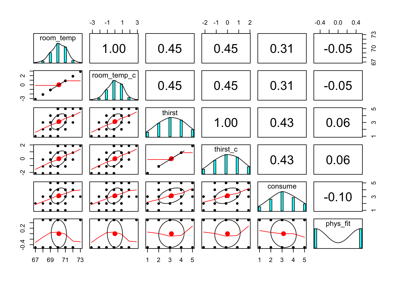
Fit linear model
flm01 <- lm(thirst ~ room_temp_c * phys_fit, data = thirst_data)Summarize linear model
summary(flm01)##
## Call:
## lm(formula = thirst ~ room_temp_c * phys_fit, data = thirst_data)
##
## Residuals:
## Min 1Q Median 3Q Max
## -1.99905 -0.90020 -0.06908 0.66235 2.00095
##
## Coefficients:
## Estimate Std. Error t value Pr(>|t|)
## (Intercept) 3.1406 0.1004 31.273 < 2e-16 ***
## room_temp_c 0.5498 0.1015 5.416 4.5e-07 ***
## phys_fit 0.1950 0.2008 0.971 0.3341
## room_temp_c:phys_fit 0.4225 0.2030 2.081 0.0401 *
## ---
## Signif. codes: 0 '***' 0.001 '**' 0.01 '*' 0.05 '.' 0.1 ' ' 1
##
## Residual standard error: 1.003 on 96 degrees of freedom
## Multiple R-squared: 0.2415, Adjusted R-squared: 0.2178
## F-statistic: 10.19 on 3 and 96 DF, p-value: 6.918e-06Print 95% confidence intervals
confint(flm01)## 2.5 % 97.5 %
## (Intercept) 2.94122187 3.3399029
## room_temp_c 0.34833220 0.7513491
## phys_fit -0.20369699 0.5936651
## room_temp_c:phys_fit 0.01947918 0.8255130Plot scatterplot with slope estimates for each fitness group
Save table of predicted values
- term: Which interaction term are you interested in?
- mod: What model are you using the make predictions?
- x.var: Which variable would you want to see on your x-axis?
- xlevels: Give this argument a list of vectors (i.e., strings of values) whose values you want to make predictions for. If you have two conditions, you probably want to make predictions for the values that represent both conditions. If you have a moderator variable, you probably want to make predictions across a range of relevant, meaningful values of your moderator. Importantly, there should be people in your dataset who have scores at (or very close to) those values. In other words, be careful not to make predictions outside your variables’ observed range of values (unless that’s your goal).
pred_table01 <- effect(term = "room_temp_c:phys_fit", mod = flm01, x.var = "room_temp_c", xlevels = list(phys_fit = c(-0.5, 0.5), room_temp_c = seq(-3, 3, 1))) %>%
  as_tibble %>%
  mutate(phys_fit_lbl = phys_fit %>% recode(`-0.5` = "Normal", `0.5` = "Fit"))

# print table
kable(pred_table01)| room_temp_c | phys_fit | fit | se | lower | upper | phys_fit_lbl |
|---|---|---|---|---|---|---|
| -3 | -0.5 | 2.0272925 | 0.4095873 | 1.2142681 | 2.840317 | Normal |
| -2 | -0.5 | 2.3658851 | 0.2946487 | 1.7810120 | 2.950758 | Normal |
| -1 | -0.5 | 2.7044778 | 0.1939502 | 2.3194896 | 3.089466 | Normal |
| 0 | -0.5 | 3.0430704 | 0.1419796 | 2.7612431 | 3.324898 | Normal |
| 1 | -0.5 | 3.3816630 | 0.1855867 | 3.0132763 | 3.750050 | Normal |
| 2 | -0.5 | 3.7202556 | 0.2836712 | 3.1571727 | 4.283339 | Normal |
| 3 | -0.5 | 4.0588482 | 0.3977926 | 3.2692361 | 4.848460 | Normal |
| -3 | 0.5 | 0.9547883 | 0.4906478 | -0.0191399 | 1.928717 | Fit |
| -2 | 0.5 | 1.7158770 | 0.3413438 | 1.0383150 | 2.393439 | Fit |
| -1 | 0.5 | 2.4769657 | 0.2073590 | 2.0653613 | 2.888570 | Fit |
| 0 | 0.5 | 3.2380544 | 0.1420630 | 2.9560616 | 3.520047 | Fit |
| 1 | 0.5 | 3.9991431 | 0.2192441 | 3.5639471 | 4.434339 | Fit |
| 2 | 0.5 | 4.7602319 | 0.3558876 | 4.0538006 | 5.466663 | Fit |
| 3 | 0.5 | 5.5213206 | 0.5059109 | 4.5170953 | 6.525546 | Fit |
Save character variable with condition labels
thirst_data <- thirst_data %>%
  mutate(phys_fit_lbl = phys_fit %>% recode("-0.5" = "Normal", "0.5" = "Fit"))
ggplot2
Read this code line by line. The idea is that you’re first generating a scatterplot with your raw values and then you’re “adding (+)” layers which use the predicted values your tabled above. Put another way,
geom_line()andgeom_ribbon()are using data from the table of predicted values;geom_point()is using data from your dataset.
thirst_data %>%
  ggplot(mapping = aes(x = room_temp_c, y = thirst)) +
  geom_point(mapping = aes(color = phys_fit_lbl)) +
  geom_line(data = pred_table01, mapping = aes(x = room_temp_c, y = fit, linetype = phys_fit_lbl)) +
  geom_ribbon(data = pred_table01, mapping = aes(x = room_temp_c, y = fit, ymin = lower, ymax = upper, fill = phys_fit_lbl), alpha = 0.5) +
  scale_x_continuous(breaks = pretty(thirst_data$room_temp_c)) +
  scale_y_continuous(breaks = pretty(thirst_data$thirst)) +
  scale_color_manual(values = c("blue", "red")) +
  scale_fill_manual(values = c("blue", "red")) +
  theme(legend.position = "top")
## Warning: Ignoring unknown aesthetics: y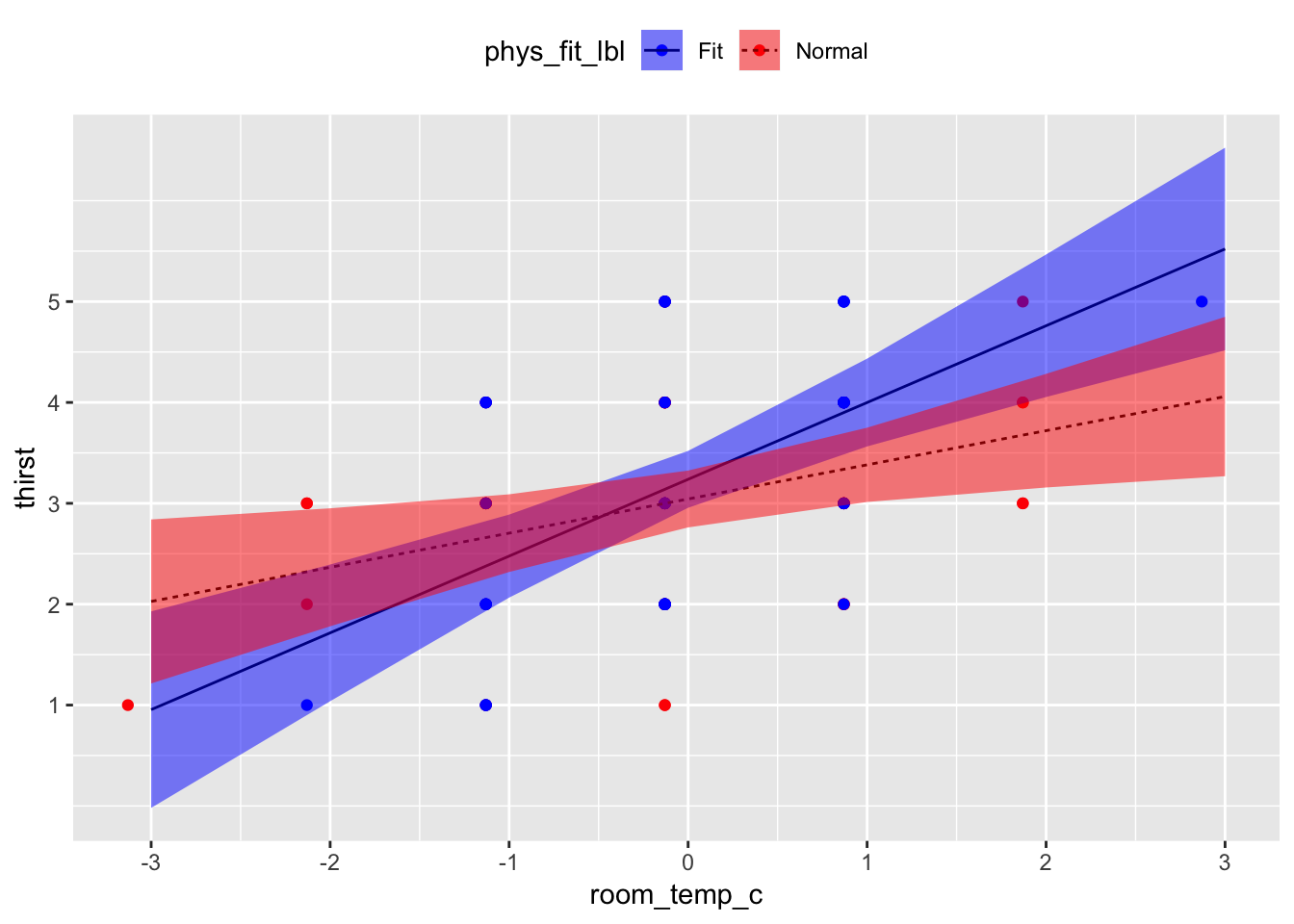
Test simple slopes
Save matrix of contrasts
- Each coefficient gets a contrast weight.
- 0 means don’t use it; cross it out.
- intercept = 0, room_temp_c = 1, phys_fit = 0, room_temp_c:phys_fit = -0.5
- In words, test the linear effect of room_temp_c when phys_fit = -0.5 (normal participants)
contmat01 <- rbind(normal = c(0, 1, 0, -0.5),
                   fit = c(0, 1, 0, 0.5))
Save general linear hypothesis object output from glht()
glht()takes your model and your contrast matrix you made above.
glht01 <- glht(model = flm01, linfct = contmat01)Contrast summary
test =
adjusted("none")means, “Don’t correct for multiple comparisons.”
summary(glht01, test = adjusted("none"))##
## Simultaneous Tests for General Linear Hypotheses
##
## Fit: lm(formula = thirst ~ room_temp_c * phys_fit, data = thirst_data)
##
## Linear Hypotheses:
## Estimate Std. Error t value Pr(>|t|)
## normal == 0 0.3386 0.1260 2.688 0.00848 **
## fit == 0 0.7611 0.1592 4.780 6.31e-06 ***
## ---
## Signif. codes: 0 '***' 0.001 '**' 0.01 '*' 0.05 '.' 0.1 ' ' 1
## (Adjusted p values reported -- none method)Interpretation
Holding all other predictors at 0, every 1°F increase in room temperature was associated with a b = 0.55 unit increase in thirst, t(96) = 5.42, 95% CI[0.35, 0.75], p < .001. Holding all other predictors at 0, there was no sufficient evidence that physically fit participants reported different mean thirst units, b = 0.20, than normal participants, t(96) = 0.97, 95% CI[-0.20, 0.59], p = .334. However, the association between room temperature and thirst was different between fitness groups, b = 0.42, t(96) = 2.08, 95% CI[0.02, 0.83], p = .040. Among normal participants, every 1°F increase in room temperature was associated with a b = 0.34 unit increase in thirst, t(96) = 2.69, p = .008; in contrast, among physically fit participants, every 1°F increase in room temperature was associated with a b = 0.76 unit increase in thirst, t(96) = 4.78, p < .001.
Data: Example 1 (continuous x continuous interaction)
Data come from the example in Chapter 7 from Cohen, Cohen, Aiken, & West (2003, p. 276) [C07E01DT.txt]
endurance <- "data/C07E01DT.txt" %>% read_table(col_names = c("id", "xage", "zexer", "yendu"))Mean-center predictors
i.e., mean-center everything but the yendu variable
endurance <- endurance %>% mutate(xage_c = xage - mean(xage),
                                  zexer_c = zexer - mean(zexer))
Print first and last five observations
endurance %>%
  headTail() %>%
kable()| id | xage | zexer | yendu | xage_c | zexer_c |
|---|---|---|---|---|---|
| 1 | 60 | 10 | 18 | 10.82 | -0.67 |
| 2 | 40 | 9 | 36 | -9.18 | -1.67 |
| 3 | 29 | 2 | 51 | -20.18 | -8.67 |
| 4 | 47 | 10 | 18 | -2.18 | -0.67 |
| … | … | … | … | … | … |
| 247 | 45 | 9 | 37 | -4.18 | -1.67 |
| 248 | 60 | 7 | 0 | 10.82 | -3.67 |
| 249 | 57 | 11 | 18 | 7.82 | 0.33 |
| 250 | 56 | 12 | 24 | 6.82 | 1.33 |
Visualize relationships
It’s always a good idea to look at your data. Check some assumptions.
endurance %>%
  select(xage, zexer, yendu, xage_c, zexer_c) %>%
  pairs.panels()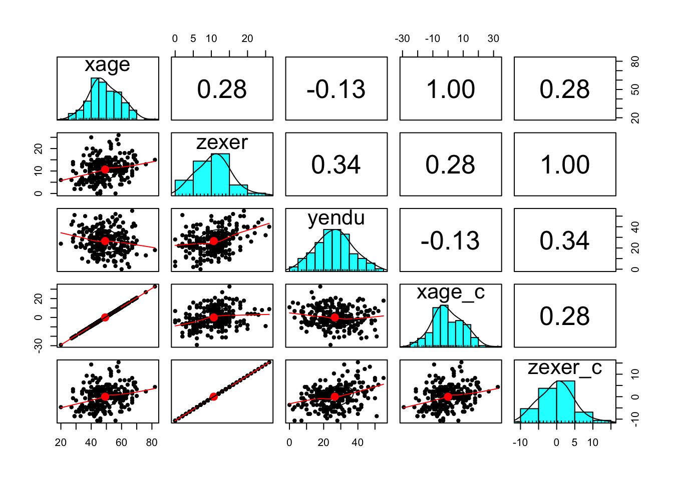
Fit linear model
flm02 <- lm(yendu ~ zexer_c * xage_c, data = endurance)Summarize linear model
summary(flm02)##
## Call:
## lm(formula = yendu ~ zexer_c * xage_c, data = endurance)
##
## Residuals:
## Min 1Q Median 3Q Max
## -21.165 -6.939 0.269 6.300 21.299
##
## Coefficients:
## Estimate Std. Error t value Pr(>|t|)
## (Intercept) 25.88872 0.64662 40.037 < 2e-16 ***
## zexer_c 0.97272 0.13653 7.124 1.20e-11 ***
## xage_c -0.26169 0.06406 -4.085 6.01e-05 ***
## zexer_c:xage_c 0.04724 0.01359 3.476 0.000604 ***
## ---
## Signif. codes: 0 '***' 0.001 '**' 0.01 '*' 0.05 '.' 0.1 ' ' 1
##
## Residual standard error: 9.7 on 241 degrees of freedom
## Multiple R-squared: 0.2061, Adjusted R-squared: 0.1962
## F-statistic: 20.86 on 3 and 241 DF, p-value: 4.764e-12Print 95% confidence intervals
confint(flm02)## 2.5 % 97.5 %
## (Intercept) 24.61497596 27.16246675
## zexer_c 0.70376546 1.24166505
## xage_c -0.38788631 -0.13549322
## zexer_c:xage_c 0.02046862 0.07402086Plot scatterplot with slope estimates for percentiles
Save quantiles of mean-centered age
You’ll use these for plotting and simple slopes.
(xage_cqs <- quantile(endurance$xage_c))## 0% 25% 50% 75% 100%
## -29.183673 -6.183673 -1.183673 6.816327 32.816327Save table of predicted values
xage_cqs[2:4]means, “subset the 2nd, 3rd, and 4th value in xage_cqs”
- term: Which interaction term are you interested in?
- mod: What model are you using to make predictions?
- x.var: Which variable would you want to see on your x-axis?
- xlevels: Give this argument a list of vectors (i.e., strings of values) whose values you want to make predictions for. If you have two conditions, you probably want to make predictions for the values that represent both conditions. If you have a moderator variable, you probably want to make predictions across a range of relevant, meaningful values of your moderator. Importantly, there should be people in your dataset who have scores at (or very close to) those values. In other words, be careful not make predictions outside your variables’ observed range of values (unless that’s your goal).
pred_table02 <- effect(term = "zexer_c:xage_c", mod = flm02, x.var = "zexer_c", xlevels = list(zexer_c = pretty(endurance$zexer_c), xage_c = xage_cqs[2:4])) %>%
  as_tibble %>%
  mutate(xage_c_lbl = xage_c %>% factor(levels = xage_cqs[2:4], labels = c("25th Percentile", "50th Percentile", "75th Percentile")))

# print table
kable(pred_table02)| zexer_c | xage_c | fit | se | lower | upper | xage_c_lbl |
|---|---|---|---|---|---|---|
| -15 | -6.183674 | 17.298387 | 2.2198327 | 12.925636 | 21.67114 | 25th Percentile |
| -10 | -6.183674 | 20.701233 | 1.5254098 | 17.696395 | 23.70607 | 25th Percentile |
| -5 | -6.183674 | 24.104079 | 0.9354140 | 22.261448 | 25.94671 | 25th Percentile |
| 0 | -6.183674 | 27.506925 | 0.7563266 | 26.017071 | 28.99678 | 25th Percentile |
| 5 | -6.183674 | 30.909772 | 1.1907841 | 28.564098 | 33.25545 | 25th Percentile |
| 10 | -6.183674 | 34.312618 | 1.8473793 | 30.673546 | 37.95169 | 25th Percentile |
| 15 | -6.183674 | 37.715464 | 2.5605781 | 32.671493 | 42.75943 | 25th Percentile |
| 20 | -6.183674 | 41.118310 | 3.2938149 | 34.629968 | 47.60665 | 25th Percentile |
| -15 | -1.183674 | 12.446583 | 2.1146888 | 8.280950 | 16.61222 | 50th Percentile |
| -10 | -1.183674 | 17.030547 | 1.4844112 | 14.106471 | 19.95462 | 50th Percentile |
| -5 | -1.183674 | 21.614512 | 0.9240868 | 19.794194 | 23.43483 | 50th Percentile |
| 0 | -1.183674 | 26.198477 | 0.6506056 | 24.916877 | 27.48008 | 50th Percentile |
| 5 | -1.183674 | 30.782441 | 0.9547410 | 28.901739 | 32.66314 | 50th Percentile |
| 10 | -1.183674 | 35.366406 | 1.5227162 | 32.366874 | 38.36594 | 50th Percentile |
| 15 | -1.183674 | 39.950370 | 2.1551544 | 35.705026 | 44.19571 | 50th Percentile |
| 20 | -1.183674 | 44.534335 | 2.8088446 | 39.001315 | 50.06735 | 50th Percentile |
| -15 | 6.816326 | 4.683696 | 2.9239000 | -1.075966 | 10.44336 | 75th Percentile |
| -10 | 6.816326 | 11.157450 | 2.0956730 | 7.029276 | 15.28562 | 75th Percentile |
| -5 | 6.816326 | 17.631204 | 1.3214234 | 15.028190 | 20.23422 | 75th Percentile |
| 0 | 6.816326 | 24.104958 | 0.7823900 | 22.563763 | 25.64615 | 75th Percentile |
| 5 | 6.816326 | 30.578713 | 0.9948712 | 28.618959 | 32.53847 | 75th Percentile |
| 10 | 6.816326 | 37.052467 | 1.6967803 | 33.710054 | 40.39488 | 75th Percentile |
| 15 | 6.816326 | 43.526221 | 2.5059964 | 38.589768 | 48.46267 | 75th Percentile |
| 20 | 6.816326 | 49.999975 | 3.3455392 | 43.409743 | 56.59021 | 75th Percentile |
ggplot2
Read this code line by line. The idea is that you’re first generating a scatterplot with your raw values and then you’re “adding (+)” layers which use the predicted values your tabled above. Put another way,
geom_line()andgeom_ribbon()are using data from the table of predicted values;geom_point()is using data from your dataset. The colors here are probably overkill, but the idea is that darker red values mean those participants are older; in this way, color gives you a sense of the distribution of participant age without plotting another dimension.
endurance %>%
  ggplot(mapping = aes(x = zexer_c, y = yendu)) +
  geom_point(mapping = aes(color = xage_c)) +
  geom_line(data = pred_table02, mapping = aes(x = zexer_c, y = fit, linetype = xage_c_lbl)) +
  geom_ribbon(data = pred_table02, mapping = aes(x = zexer_c, y = fit, ymin = lower, ymax = upper, fill = xage_c_lbl), alpha = 0.5) +
  scale_x_continuous(breaks = pretty(endurance$zexer_c)) +
  scale_y_continuous(breaks = pretty(endurance$yendu)) +
  scale_color_gradient(low = "blue", high = "red") +
  scale_fill_manual(values = c("blue", "purple", "red")) +
  theme(legend.position = "top")
## Warning: Ignoring unknown aesthetics: y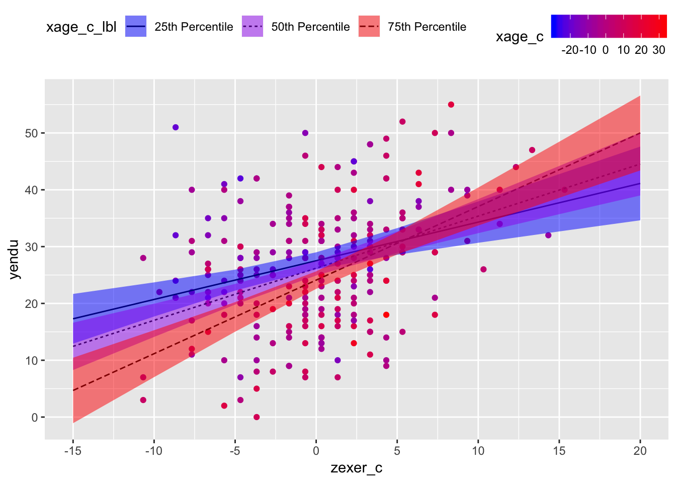
Test simple slopes
Save matrix of contrasts
- Each coefficient gets a contrast weight.
- 0 means don’t use it; cross it out.
- intercept = 0, zexer_c = 1, xage_c = 0, zexer_c:xage_c = 25th percentile of age
- In words, test the linear effect of zexer_c when xage_c = 25th percentile of age (younger participants)
contmat02 <- rbind(xage_c25 = c(0, 1, 0, xage_cqs[2]),
                   xage_c50 = c(0, 1, 0, xage_cqs[3]),
                   xage_c75 = c(0, 1, 0, xage_cqs[4]))
Save general linear hypothesis object output from glht()
glht()takes your model and your contrast matrix you made above.
glht02 <- glht(model = flm02, linfct = contmat02)Contrast summary
test =
adjusted("none")means, “Don’t correct for multiple comparisons.”
summary(glht02, test = adjusted("none"))##
## Simultaneous Tests for General Linear Hypotheses
##
## Fit: lm(formula = yendu ~ zexer_c * xage_c, data = endurance)
##
## Linear Hypotheses:
## Estimate Std. Error t value Pr(>|t|)
## xage_c25 == 0 0.6806 0.1516 4.490 1.11e-05 ***
## xage_c50 == 0 0.9168 0.1356 6.763 1.02e-10 ***
## xage_c75 == 0 1.2948 0.1739 7.446 1.70e-12 ***
## ---
## Signif. codes: 0 '***' 0.001 '**' 0.01 '*' 0.05 '.' 0.1 ' ' 1
## (Adjusted p values reported -- none method)Interpretation
Holding all other predictors at 0, every 1 year increase in vigorous exercise (mean-centered) was associated with a b = 0.97 minute increase in jogging on a treadmill (i.e., endurance), t(241) = 7.12, 95% CI[0.70, 1.24], p < .001. Holding all other predictors at 0, every 1 year increase in age (mean-centered) was associated with a b = -0.26 minute decrease in jogging on a treadmill, t(241) = 4.09, 95% CI[-0.39,, -0.14], p = .334. However, the association between years of vigorous exercise and minutes jogging on a treadmill was different at different ages, b = 0.45, t(241) = 3.48, 95% CI[0.02, 0.07], p < .001. Among people at the 25th percentile of age in the sample, every 1 year increase in vigorous exercise (mean-centered) was associated with a b = 0.68 minute increase in jogging on a treadmill, t(241) = 4.49, p < .001; in contrast, among people at the 75th percentile of age in the sample, every 1 year increase in vigorous exercise (mean-centered) was associated with a b = 1.29 minute increase in jogging on a treadmill, t(241) = 7.45, p < .001.
Resources
- Cohen, J., Cohen, P., West, S. G., & Aiken, L. S. (2003). Applied multiple regression/correlation analysis for the behavioral sciences. New York, NY: Routledge.
- MacKinnon, D. P. (2008). Introduction to statistical mediation analysis. New York, NY: Lawrence Erlbaum Associates.
- Revelle, W. (2017) How to use the psych package for mediation/moderation/regression analysis. [.pdf]
General word of caution
Above, I listed resources prepared by experts on these and related topics. Although I generally do my best to write accurate posts, don’t assume my posts are 100% accurate or that they apply to your data or research questions. Trust statistics and methodology experts, not blog posts.
Nicholas M. Michalak
Data Scientist | Ph.D. Social Psychology
I study how both modern and evolutionarily-relevant threats affect how people perceive themselves and others.