Logistic Regression in R
Introduction
In this post, I’ll introduce the logistic regression model in a semi-formal, fancy way. Then, I’ll generate data from some simple models:
- 1 quantitative predictor
- 1 categorical predictor
- 2 quantitative predictors
- 1 quantitative predictor with a quadratic term
I’ll model data from each example using linear and logistic regression. Throughout the post, I’ll explain equations, terms, output, and plots. Here are some key takeaways:
With regard to diagnostic accuracy (i.e., correctly classifying 1s and 0s), linear regression and logistic regression perform equally well in the simple cases I present in this post.
However, linear regression often makes impossible predictions (probabilities below 0% or above 100%).
Partly because of the S-shape of the logistic function, the predicted values from multiple logistic regression depend on the values of all the predictors in the model, even when there is no true interaction. The rotating, 3-D response surfaces at the end of each multiple regression example should make this point clearer.
Install and/or load packages for this post
I’ve commented out the code for installing packages above code for loading those packages.
# install.packages("tidyverse")
# install.packages("gifski")
# install.packages("lattice")
# install.packages("scales")
# install.packages("kableExtra")
# install.packages("pROC")

library(tidyverse)
library(gifski)
library(lattice)
library(scales)
library(kableExtra)
library(pROC)
Save ggplot2 theme for this post
I’ll use this theme in ggplot2 plots throughout the post.
post_theme <- theme_bw() +
  theme(legend.position = "top",
        plot.title = element_text(hjust = 0, size = rel(1.5), face = "bold"),
        plot.margin = unit(c(1, 1, 1, 1), units = "lines"),
        axis.title.x = element_text(family = "Times New Roman", color = "Black", size = 12),
        axis.title.y = element_text(family = "Times New Roman", color = "Black", size = 12),
        axis.text.x = element_text(family = "Times New Roman", color = "Black", size = 12),
        axis.text.y = element_text(family = "Times New Roman", color = "Black", size = 12),
        legend.title = element_text(family = "Times New Roman", color = "Black", size = 12),
        legend.text = element_text(family = "Times New Roman", color = "Black", size = 12))
What is logistic regression?
Logistic regression models binary random variables, which take on two values, 1 or 0, whose probabilities are represented as \(\pi\) and \(1 - \pi\). The model relies on the logistic function to estimate the probability, \(\pi\), that the binary dependent variable equals 1. The logistic function looks like this:
\(f(x) = \frac{1}{1 + e^{-x}}\)
where e represents Euler’s number. If you are familiar with the multiple linear regression equation:
\(Y_i = \beta_0 + \beta_1x_{i1} + ... \beta_{p - 1}x_{i, p-1} + \epsilon_i\)
where i represent random observations, Y represents a random dependent variable; \(\beta\) represents the population regression coefficient; x represent random predictor variables; p represents any number of random predictor variables; and \(\epsilon\) represents random error, then you will be familiar with the same linear combination of predictors as they appear in the logistic function below:
\(\pi_i = \frac{1}{1 + e^{-(\beta_0 + \beta_1x_{i1} + ... \beta_{p - 1}x_{i, p-1})}} + \epsilon_i\).
Logistic regression relies on maximum likelihood to estimate regression coefficients using a “logit link”: It “links” the linear combination of predictor variables to the natural logarithm of the odds,
\(log_e(\frac{\pi}{1 - \pi})\).
The odds are simply the ratio of the probability that the dependent variable equals 1 (the numerator) to the probability that the dependent variable equals 0 (or not 1, the denominator):
\(\frac{\pi}{1 - \pi}\)
The logarithm of the odds (log-odds) represents the power to which e (Euler’s number) must be raised to produce the odds. Transforming probability, \(\pi\), into log-odds and necessary algebra applied to the right side of the equation results in this equation for logistic regression:
\(\log_e(\frac{\pi_i}{1 - \pi_i}) = \beta_0 + \beta_1x_{i1} + ... \beta_{p - 1}x_{i, p-1} + \epsilon_i\).
What is the relationship between probability and odds?
Below you can see a table whose first column displays a sequence of proportions, from 0 to 1 in steps of 0.10. You can also see how to transform proportions to odds and log-odds using R code (the rest is just fancy).
Table
tibble(event = seq(0, 1, 0.10),
       noevent = 1 - event,
       odds = event / noevent,
       # The default base is Euler's number. I make that explicit in the code below.
       logodds = log(odds, base = exp(1))) %>%
  round(2) %>%
  set_names(c("p", "1 - p", "Odds", "Log-Odds")) %>%
  kable() %>%
kable_styling(bootstrap_options = c("striped", "hover"))| p | 1 - p | Odds | Log-Odds |
|---|---|---|---|
| 0.0 | 1.0 | 0.00 | -Inf |
| 0.1 | 0.9 | 0.11 | -2.20 |
| 0.2 | 0.8 | 0.25 | -1.39 |
| 0.3 | 0.7 | 0.43 | -0.85 |
| 0.4 | 0.6 | 0.67 | -0.41 |
| 0.5 | 0.5 | 1.00 | 0.00 |
| 0.6 | 0.4 | 1.50 | 0.41 |
| 0.7 | 0.3 | 2.33 | 0.85 |
| 0.8 | 0.2 | 4.00 | 1.39 |
| 0.9 | 0.1 | 9.00 | 2.20 |
| 1.0 | 0.0 | Inf | Inf |
View the relationship between probablity and odds
The function “speeds up” between 90% and 100%.
tibble(event = seq(0, 1, 0.01),
       noevent = 1 - event,
       odds = event / noevent,
       logodds = log(odds, base = exp(1))) %>%
  ggplot(mapping = aes(x = event, y = odds)) +
  geom_line() +
  scale_x_continuous(breaks = seq(0, 1, 0.10), labels = percent_format(accuracy = 1)) +
  labs(x = expression("Probability that Y = 1": pi), y = NULL, title = expression(Odds: frac(pi, (1 - pi)))) +
  post_theme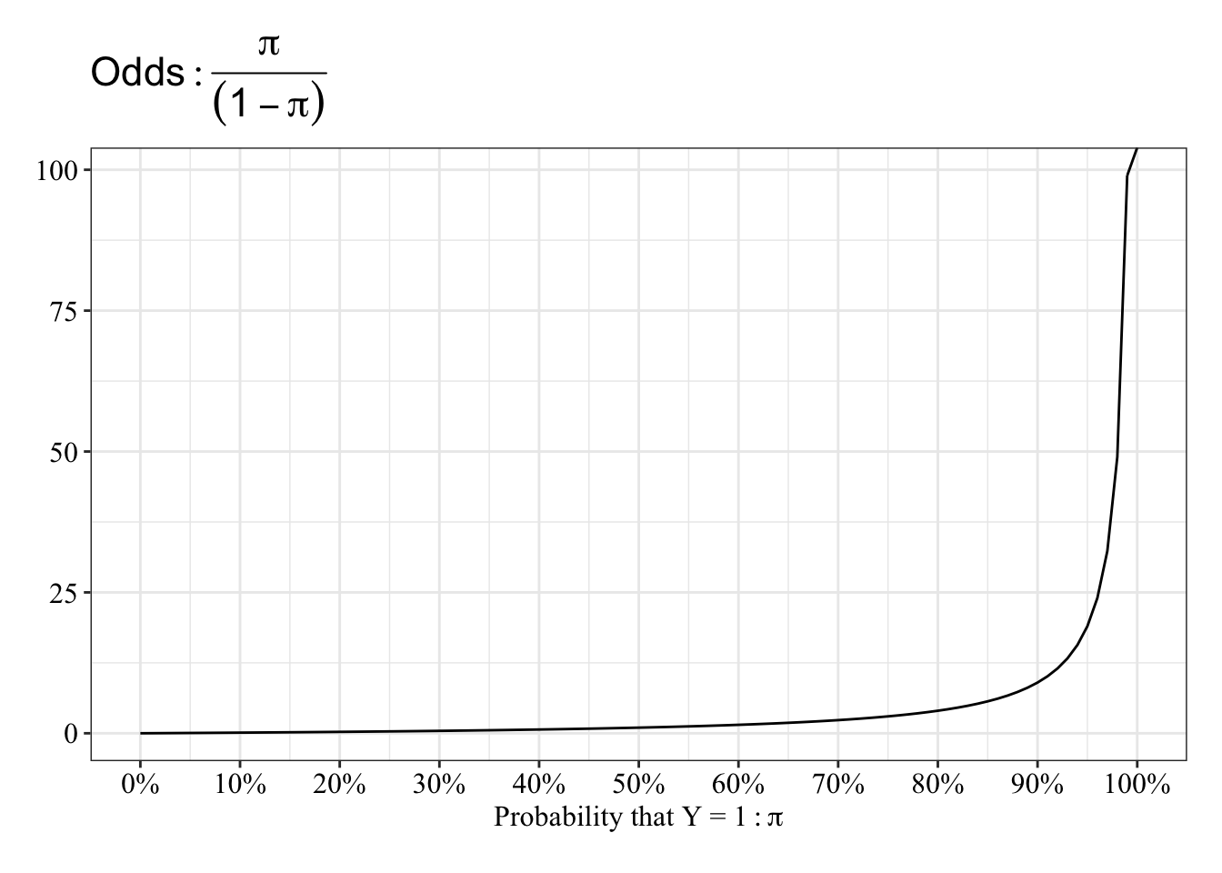
View the relationship between probablity and log-odds
The function is almost linear between 20 and 80%, and it “speeds up” between 0% and 20% and between 80% and 100%.
tibble(event = seq(0, 1, 0.01),
       noevent = 1 - event,
       odds = event / noevent,
       logodds = log(odds, base = exp(1))) %>%
  ggplot(mapping = aes(x = event, y = logodds)) +
  geom_line() +
  scale_x_continuous(breaks = seq(0, 1, 0.10), labels = percent_format(accuracy = 1)) +
  labs(x = expression("Probability that Y = 1": pi), y = NULL, title = expression(Logit: log[e](frac(pi, (1 - pi))))) +
  post_theme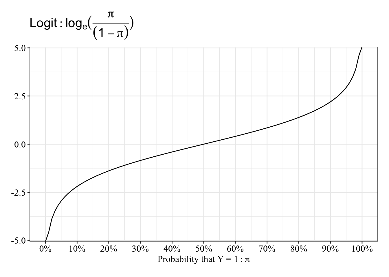
What are some problems with using linear regression to model binary dependent variables?
The simple answer is that the model will not best represent the process that generated the data. Here’s what can (or will happen) when you model a binary dependent variable with linear regression.
- Residuals (\(Y_{Observed} - Y_{Predicted}\)) won’t have a normal distribution. When \(Y_i = 1\), the residual, \(\epsilon_i\), will equal
\(1 - \hat{\pi_i} = 1 - \beta_0 + \beta_1x_{i1} + ... \beta_{p - 1}x_{i, p-1}\).
Corresponingly, When \(Y_i = 0\), the residual, \(\epsilon_i\), will equal
\(0 - \hat{\pi_i} = -\beta_0 - \beta_1x_{i1} - ... \beta_{p - 1}x_{i, p-1}\).
So, any given predicted value for an observation, \(\hat{\pi}\), can result in only 1 of 2 possible error values. Such errors are binary, not normal.
- The variability in residuals, \(r_i\), will depend on the predicted values themselves. The formula for the variance of the predicted values, \(\hat{\pi_i}\), includes the predicted value:
\(var(r_i) = \hat{\pi_i}(1 - \hat{\pi_i})\).
It’s like if the variability of the mean depends on the mean. Look at the inverted-U relationship between probability that \(Y_i = 1\) and the variance of its residual, \(r_i\):
tibble(pihat = seq(0, 1, 0.10),
       var_resid = pihat * (1 - pihat)) %>%
  ggplot(mapping = aes(x = pihat, y = var_resid)) +
  geom_line() +
  scale_x_continuous(breaks = seq(0, 1, 0.20), labels = percent_format(accuracy = 1)) +
  labs(x = expression(hat(pi)), y = NULL, title = expression(var(r[i]))) +
  post_theme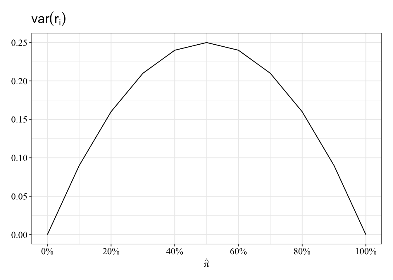
- The model can make impossible predictions outside of 0% or 100%. The mean of 0s and 1s can’t be below 0 or above 1. The probability of Y = 1 cannot be below 0% or above 100%. Linear regression does not guarantee this.
Simple Model: 1 Quantitative Predictor
\(\log_e(\frac{\pi}{1 - \pi}) = \beta_0 + \beta_1x_1\)
Generate data
Save parameters
- Sample Size = 250
- \(\beta_0\) (the intercept) = 0
- \(\beta_1\) = 1
N <- 250
b0 <- 0
b1 <- 1
Sample predictor (Normal distribution)
\(X_1 \sim \mathcal{N}(\mu, \sigma^2) = \mathcal{N}(0, 1)\)
# Set random seed so results can be reproduced
set.seed(533837)

x1 <- rnorm(n = N, mean = 0, sd = 1)
Generate data as a function of model (Binomial Distribution)
\(\mathcal{B}(n, \pi) = \mathcal{B}(1, \pi)\)
# Set random seed so results can be reproduced
set.seed(533837)

# The prob argument asks for the probability of 1 for each replicate, which is a logistic function of the additive, linear equation
y <- rbinom(n = N, size = 1, prob = plogis(b0 + b1 * x1))
Table data
The table below displays the first 10 of 250 observations.
data1 <- tibble(id = 1:N, y, x1)

data1 %>%
  head() %>%
  kable() %>%
kable_styling(bootstrap_options = c("striped", "hover"))| id | y | x1 |
|---|---|---|
| 1 | 0 | -0.6198364 |
| 2 | 1 | 1.3877764 |
| 3 | 1 | -0.1336061 |
| 4 | 1 | 0.2216941 |
| 5 | 0 | -0.3351392 |
| 6 | 1 | 1.2521676 |
Plot data
Linear and Logistic regressions make different predictions. The logistic regression (blue line) predictions follow an S-shape and fall between 0% and 100%. In contrast, the linear regression (red/orange line) makes some impossible predictions: The fit line makes predictions below 0% and above 100%.
data1 %>%
  ggplot(mapping = aes(x = x1, y = y)) +
  geom_hline(yintercept = 0, linetype = "dotted") +
  geom_hline(yintercept = 1, linetype = "dotted") +
  geom_smooth(mapping = aes(color = "Linear"), method = "glm", formula = y ~ x, method.args = list(family = gaussian(link = "identity")), se = FALSE) +
  geom_smooth(mapping = aes(color = "Logistic"), method = "glm", formula = y ~ x, method.args = list(family = binomial(link = "logit")), se = FALSE) +
  geom_point(size = 3, alpha = 0.50) +
  scale_y_continuous(breaks = seq(-1, 1, 0.20), labels = percent_format(accuracy = 1)) +
  scale_color_manual(values = c("#d55e00", "#0072b2")) +
  labs(x = expression(x[1]), y = NULL, title = bquote("Prediction:" ~ hat(pi)), color = "Model Form") +
  post_theme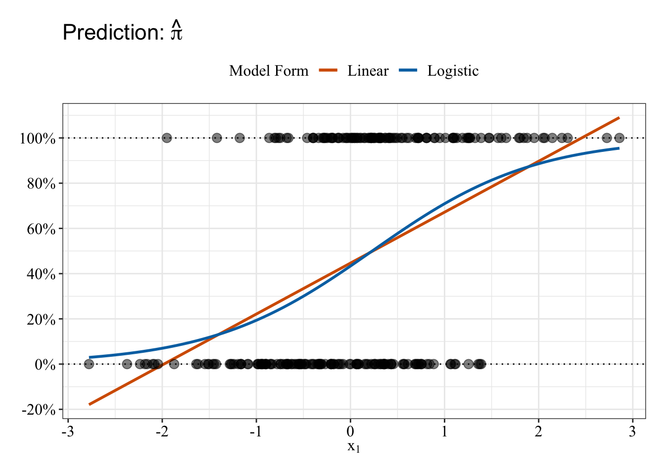
Fit linear regression
The model below is equivalent to lm(formula, data), but it uses maximum likelihood instead of the least squares method.
glm.fit1 <- glm(y ~ x1, family = gaussian(link = "identity"), data = data1)Plot residuals vs. predicted values
The plot below displays the linear regression predictions from a different perspective: residuals (i.e., prediction errors). As expected from the linear fit line in the previous plot, some predictions are impossible (orange circles), falling below 0% or above 100%. The black loess fit line can help you interpret the strange relationship between predicted values and residuals: Residuals for a given predicted value can only take on 1 of 2 values, so residuals fall on only 1 of 2 straight lines across the plot. A straight black line is consistent with no relationship between predictions and residuals, whereas any pattern in the black line suggestions errors change as some function of the model predictions.
# Save a data frame with residuals and fitted values (pihat)
pihat_residual1 <- tibble(model_form = "Linear",
                           pihat = glm.fit1$fitted.values,
                           residual = residuals.glm

                          (glm.fit1, type = "response"))

# Plot fitted values (pihat) and residuals
pihat_residual1 %>%
  mutate(impossible = ifelse(pihat < 0 | pihat > 1, "Impossible Value", "Possible Value")) %>%
  ggplot(mapping = aes(x = pihat, y = residual)) +
  geom_hline(yintercept = 0, linetype = "dashed") +
  geom_vline(xintercept = 0, linetype = "dotted") +
  geom_vline(xintercept = 1, linetype = "dotted") +
  geom_smooth(method = "loess", se = FALSE, span = 0.80, color = "black") +
  geom_point(mapping = aes(color = impossible), size = 3, alpha = 0.50) +
  scale_x_continuous(breaks = seq(-1, 1, 0.20), labels = percent_format(accuracy = 1)) +
  scale_y_continuous(breaks = seq(-1, 1, 0.20), labels = percent_format(accuracy = 1)) +
  scale_color_manual(values = c("#e69f00", "#000000")) +
  labs(x = bquote("Prediction:" ~ hat(pi)), y = expression(Residual: y - hat(pi)), color = NULL) +
  post_theme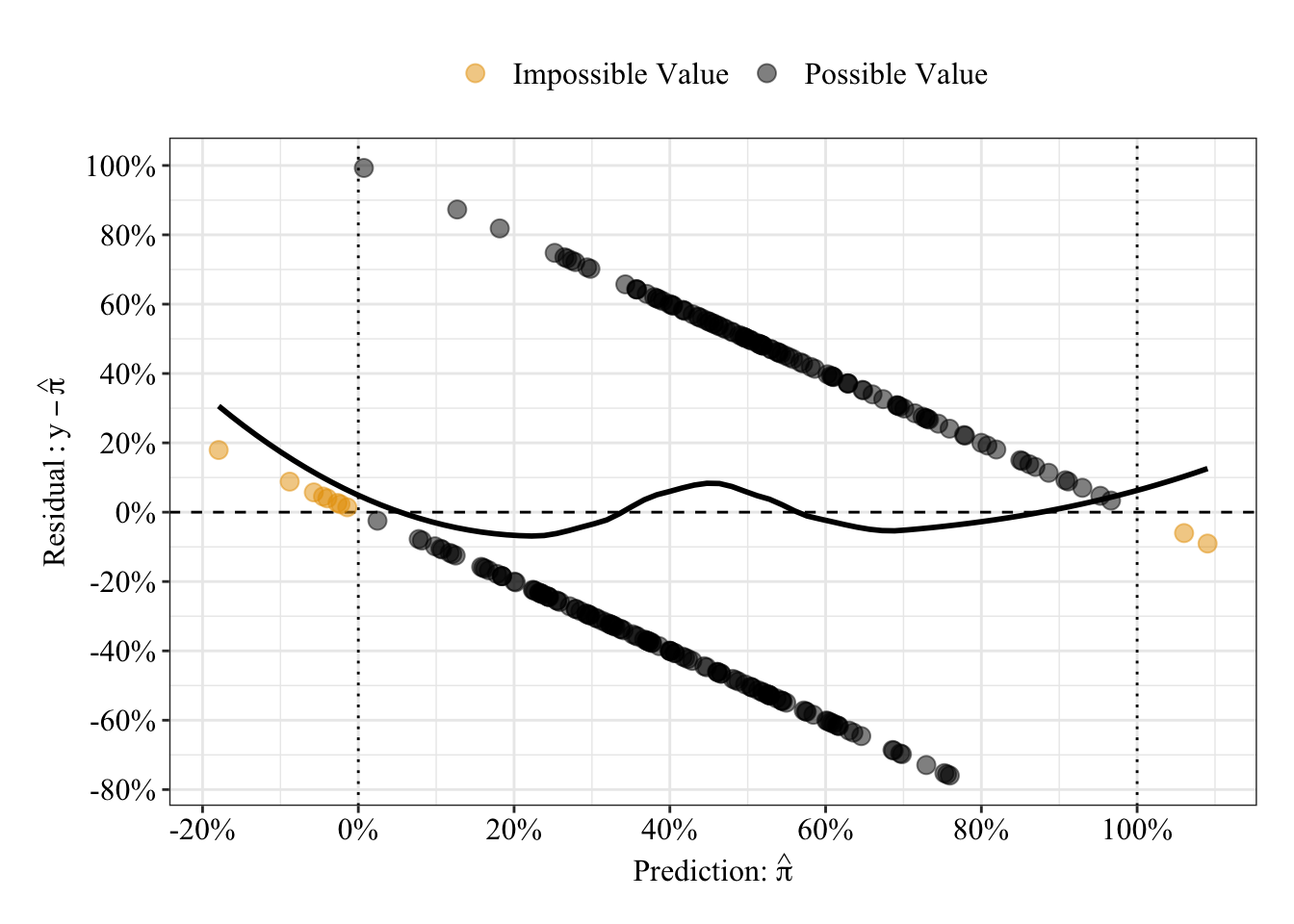
Results Summary
When \(x_1\) equals 0, the model predicts a 45% probability that Y equals 1. For every 1 unit change in \(x_1\), the predicted probability that Y equals 1 increases linearly by 23%. Ignore the other information in the output, for now.
summary(glm.fit1)##
## Call:
## glm(formula = y ~ x1, family = gaussian(link = "identity"), data = data1)
##
## Deviance Residuals:
## Min 1Q Median 3Q Max
## -0.7594 -0.3771 -0.1019 0.4589 0.9929
##
## Coefficients:
## Estimate Std. Error t value Pr(>|t|)
## (Intercept) 0.44658 0.02842 15.711 < 2e-16 ***
## x1 0.22524 0.02938 7.667 3.99e-13 ***
## ---
## Signif. codes: 0 '***' 0.001 '**' 0.01 '*' 0.05 '.' 0.1 ' ' 1
##
## (Dispersion parameter for gaussian family taken to be 0.2018494)
##
## Null deviance: 61.924 on 249 degrees of freedom
## Residual deviance: 50.059 on 248 degrees of freedom
## AIC: 313.4
##
## Number of Fisher Scoring iterations: 2Receiver Operating Characteristic Curve
The area under the receiver operating characteristic curve is 0.75, which means that 75% of the time the model is expected to decide that a random Y = 1 is actually a 1 (true positive) instead of deciding a random Y = 0 is a 1 (false positive). Think of this is a measure of diagnosticity: How often is the model expected to correctly diagnose Y = 1 observations rather than incorrectly diagnose Y = 0 observations. This AUROC value (0.75) is neither perfect (AUROC = 100%) nor consistent with chance diagnosticity (AUROC = 50%).
# Wrapping () around the code below allows me to save and print the results together
(roc.fit1 <- roc(response = glm.fit1$data$y, predictor = glm.fit1$fitted.values, direction = "<", ci = TRUE, ci.method = "boot", boot.n = 1000))
## Setting levels: control = 0, case = 1##
## Call:
## roc.default(response = glm.fit1$data$y, predictor = glm.fit1$fitted.values, direction = "<", ci = TRUE, ci.method = "boot", boot.n = 1000)
##
## Data: glm.fit1$fitted.values in 137 controls (glm.fit1$data$y 0) < 113 cases (glm.fit1$data$y 1).
## Area under the curve: 0.7471
## 95% CI: 0.6839-0.8068 (1000 stratified bootstrap replicates)# sensitivity = true positive rate and specificity = 1 - false negative rate = true negative rate
tibble(sensitivity = roc.fit1$sensitivities, specificity = roc.fit1$specificities, false_positive = 1 - specificity) %>%
ggplot(mapping = aes(x = false_positive, y = sensitivity)) +
geom_line() +
geom_area(alpha = 0.25, position = "identity") +
geom_abline(intercept = 0, slope = 1, linetype = "dashed") +
scale_x_continuous(breaks = seq(0, 1, 0.20), labels = percent_format(accuracy = 1)) +
scale_y_continuous(breaks = seq(0, 1, 0.20), labels = percent_format(accuracy = 1)) +
labs(x = "False Positive Rate", y = "Sensitivity (True Positive Rate)") +
post_theme
Fit logistic regression
This syntax for logistic regression is similar to that for the linear regression except you use the Binomial Distribution (a.k.a., Bernoulli Distribution because there is only 1 trial) with a logit link.
glm.fit2 <- glm(y ~ x1, family = binomial(link = "logit"), data = data1)Plot residuals vs. predicted values
Like the previous plot of residuals vs. predicted values, a given predicted value can only take on 1 of 2 residual values because the observations equal 0 or 1. So, the residuals fall onto 1 or 2 lines that span the plot. Unlike the predicted probabilities form the linear regression, the predicted probabilities from the logistic regression are bounded between 0% and 100%.
# Save a data frame with residuals and fitted values (pihat)
pihat_residual2 <- tibble(model_form = "Logistic",
                          pihat = glm.fit2$fitted.values,
                          residual = residuals.glm(glm.fit2, type = "response"))

# Plot fitted values (pihat) and residuals from both linear and logistic models
pihat_residual1 %>%
  bind_rows(pihat_residual2) %>%
  ggplot(mapping = aes(x = pihat, y = residual, color = model_form)) +
  geom_hline(yintercept = 0, linetype = "dashed") +
  geom_vline(xintercept = 0, linetype = "dotted") +
  geom_vline(xintercept = 1, linetype = "dotted") +
  geom_smooth(method = "loess", se = FALSE, span = 0.80) +
  geom_point(size = 3, alpha = 0.50) +
  scale_x_continuous(breaks = seq(-0.20, 1.20, 0.20), labels = percent_format(accuracy = 1)) +
  scale_y_continuous(breaks = seq(-1, 1, 0.20), labels = percent_format(accuracy = 1)) +
  scale_color_manual(values = c("#d55e00", "#0072b2")) +
  labs(x = expression(Prediction: hat(pi)), y = expression(Residual: y - hat(pi)), color = "Model Form") +
  post_theme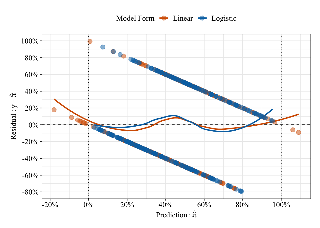
Results Summary
summary(glm.fit2)##
## Call:
## glm(formula = y ~ x1, family = binomial(link = "logit"), data = data1)
##
## Deviance Residuals:
## Min 1Q Median 3Q Max
## -1.7748 -0.9260 -0.4941 1.0859 2.2829
##
## Coefficients:
## Estimate Std. Error z value Pr(>|z|)
## (Intercept) -0.2673 0.1428 -1.872 0.0612 .
## x1 1.1593 0.1864 6.219 5.01e-10 ***
## ---
## Signif. codes: 0 '***' 0.001 '**' 0.01 '*' 0.05 '.' 0.1 ' ' 1
##
## (Dispersion parameter for binomial family taken to be 1)
##
## Null deviance: 344.27 on 249 degrees of freedom
## Residual deviance: 290.42 on 248 degrees of freedom
## AIC: 294.42
##
## Number of Fisher Scoring iterations: 4Odds Ratios
When \(x_1\) equals 0, the odds that Y = 1 are 0.77, which means Y = 0 is 23% more likey than Y = 1. For every 1 unit change in \(x_1\), the odds that Y = 1 increase by 219% (OR = 3.19).
# exp() (see help("exp)) raises the base value to the given value (e.g., by default, it raises Euler's number to the value given). Raising Euler's number to the given log-odds (logit) is the odds: e^log-odds = odds
exp(coefficients(glm.fit2))
## (Intercept) x1
## 0.7654192 3.1877508Compare regression coefficients to population values
tibble(Model = rep(c("Population", "Linear", "Logistic"), times = 2),
       Coefficient = rep(c("B0 (Intercept)", "B1"), each = 3),
       "Log-Odds" = c(b0, qlogis(coefficients(glm.fit1)[1]), coefficients(glm.fit2)[1], b1, qlogis(1 - coefficients(glm.fit1)[2]), coefficients(glm.fit2)[2]),
       "Linear Probability" = c(plogis(b0), coefficients(glm.fit1)[1], plogis(coefficients(glm.fit2)[1]), 1 - plogis(b1), coefficients(glm.fit1)[2], 1 - plogis(coefficients(glm.fit2)[2]))) %>%
  mutate_if(is.numeric, round, 2) %>%
  kable() %>%
kable_styling(bootstrap_options = c("striped", "hover"))| Model | Coefficient | Log-Odds | Linear Probability |
|---|---|---|---|
| Population | B0 (Intercept) | 0.00 | 0.50 |
| Linear | B0 (Intercept) | -0.21 | 0.45 |
| Logistic | B0 (Intercept) | -0.27 | 0.43 |
| Population | B1 | 1.00 | 0.27 |
| Linear | B1 | 1.24 | 0.23 |
| Logistic | B1 | 1.16 | 0.24 |
Model Fit (compared to the Null Model)
anova(glm.fit2, test = "Chisq")## Analysis of Deviance Table
##
## Model: binomial, link: logit
##
## Response: y
##
## Terms added sequentially (first to last)
##
##
## Df Deviance Resid. Df Resid. Dev Pr(>Chi)
## NULL 249 344.27
## x1 1 53.847 248 290.42 2.167e-13 ***
## ---
## Signif. codes: 0 '***' 0.001 '**' 0.01 '*' 0.05 '.' 0.1 ' ' 1What is deviance?
Deviance is a measure of the lack of fit to the data. As you can see in the equations and R code below, deviance (roughly) represents the difference (i.e., subtraction) between two models.
Model Deviance for k predictors. \(D_k = -2[log_e(L_k) - log_e(L_{Perfect})]\)
Null Model Deviance. \(D_{Null} = -2[log_e(L_{Null}) - log_e(L_{Perfect})]\)
where D represents deviance (roughly, a measure of the lack of a model’s fit to the data) and L represents the maximum likelihood.
# Maximum Likelihood for the null model (intercept only, no predictors)
mle_null <- exp(logLik(glm(y ~ 1, family = binomial(link = "logit"), data = data1)))

# Maximum Likelihood for the perfect model
mle_perfect <- 1

# Maximum Likelihood for the model with 1 predictor
mle_1 <- exp(logLik(glm.fit2))

# Null Deviance
D_null <- -2 * (log(mle_null) - log(mle_perfect))

# Model Deviance (1 predictor, k = 1)
D_1 <- -2 * (log(mle_1) - log(mle_perfect))

# Table and print results
tibble(Model = c("Null", "Perfect", "k = 1"),
       "Maximum Likelihood" = c(mle_null, mle_perfect, mle_1),
       "Log-Likelihood" = log(c(mle_null, mle_perfect, mle_1)),
       Deviance = c(D_null, 0, D_1)) %>%
  mutate_at("Maximum Likelihood", scientific) %>%
  mutate_at(c("Log-Likelihood", "Deviance"), round, 2) %>%
  kable() %>%
kable_styling(bootstrap_options = c("striped", "hover"))| Model | Maximum Likelihood | Log-Likelihood | Deviance |
|---|---|---|---|
| Null | 1.75e-75 | -172.13 | 344.27 |
| Perfect | 1.00e+00 | 0.00 | 0.00 |
| k = 1 | 8.64e-64 | -145.21 | 290.42 |
Receiver Operating Characteristic Curve
The area under the receiver operating characteristic curve is 0.75, which means that 75% of the time the model is expected to decide that a random Y = 1 is indeed a 1 (true positive) instead of deciding a random Y = 0 is a 1 (false positive). Think of this is a measure of diagnosticity: How often is the model expected to correctly diagnose Y = 1 observations rather than incorrectly diagnose Y = 0 observations. This AUROC value is neither perfect (AUROC = 100%) nor consistent with chance diagnosticity (AUROC = 50%).
# Wrapping () around the code below allows me to save and print the results together
(roc.fit2 <- roc(response = glm.fit2$data$y, predictor = glm.fit2$fitted.values, direction = "<", ci = TRUE, ci.method = "boot", boot.n = 1000))
## Setting levels: control = 0, case = 1##
## Call:
## roc.default(response = glm.fit2$data$y, predictor = glm.fit2$fitted.values, direction = "<", ci = TRUE, ci.method = "boot", boot.n = 1000)
##
## Data: glm.fit2$fitted.values in 137 controls (glm.fit2$data$y 0) < 113 cases (glm.fit2$data$y 1).
## Area under the curve: 0.7471
## 95% CI: 0.6817-0.8066 (1000 stratified bootstrap replicates)# sensitivity = true positive rate and specificity = 1 - false negative rate = true negative rate
tibble(sensitivity = roc.fit2$sensitivities, specificity = roc.fit2$specificities, false_positive = 1 - specificity) %>%
ggplot(mapping = aes(x = false_positive, y = sensitivity)) +
geom_line() +
geom_area(alpha = 0.25, position = "identity") +
geom_abline(intercept = 0, slope = 1, linetype = "dashed") +
scale_x_continuous(breaks = seq(0, 1, 0.20), labels = percent_format(accuracy = 1)) +
scale_y_continuous(breaks = seq(0, 1, 0.20), labels = percent_format(accuracy = 1)) +
labs(x = "False Positive Rate", y = "Sensitivity (True Positive Rate)") +
post_theme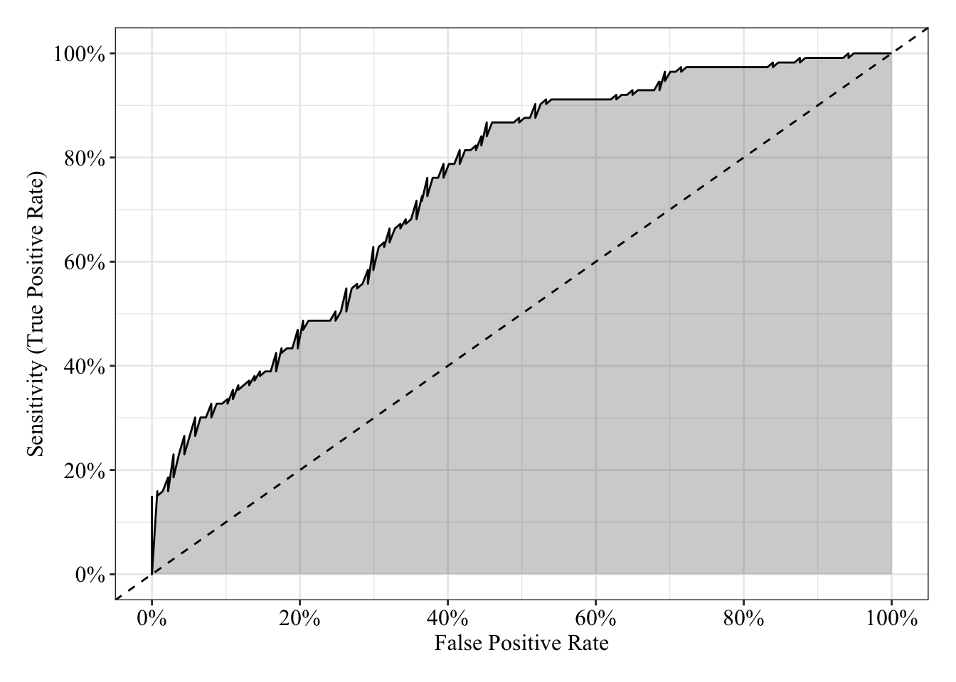
Simple Model: 1 Categorical Predictor
\(\log_e(\frac{\pi}{1 - \pi}) = \beta_0 + \beta_1x_1\)
Generate data
Save parameters
- Sample Size = 250
- \(\beta_0\) (the intercept) = -1.73
- \(\beta_1\) = 1
N <- 250

# Determine the logit for 15%
(b0 <- qlogis(0.15))
## [1] -1.734601b1 <- -1Save predictor with equal group sizes
# Set random seed so results can be reproduced
set.seed(760814)

x1 <- rep(c(-0.5, 0.5), each = N / 2)
Generate data as a function of model (Binomial Distribution)
\(\mathcal{B}(n, \pi) = \mathcal{B}(1, \pi)\)
# Set random seed so results can be reproduced
set.seed(760814)

# The prob argument asks for the probability of 1 for each replicate, which is a logistic function of the additive, linear equation
y <- rbinom(n = N, size = 1, prob = plogis(b0 + b1 * x1))
Table data
data2 <- tibble(id = 1:N, y, x1, group_fac = factor(x1, labels = LETTERS[1:2]))

data2 %>%
  sample_n(size = 6) %>%
  kable() %>%
kable_styling(bootstrap_options = c("striped", "hover"))| id | y | x1 | group_fac |
|---|---|---|---|
| 167 | 0 | 0.5 | B |
| 49 | 0 | -0.5 | A |
| 11 | 1 | -0.5 | A |
| 197 | 0 | 0.5 | B |
| 191 | 0 | 0.5 | B |
| 42 | 1 | -0.5 | A |
Plot data
The predicted probabilities in this case are the proportion of Y = 1 for each of group. These will be the same for linear and logistic regression. The dashed line represents the grand mean.
data2 %>%
  ggplot(mapping = aes(x = group_fac, y = y)) +
  stat_summary(geom = "bar", fun.data = mean_cl_normal) +
  geom_hline(data = function(x) mutate(x, grand_mean = mean(y)) %>% filter(!duplicated(.)), mapping = aes(yintercept = grand_mean), linetype = "dashed") +
  scale_y_continuous(breaks = seq(0, 1, 0.05), labels = percent_format(accuracy = 1)) +
  labs(x = NULL, y = NULL, title = expression(Prediction: hat(pi))) +
  post_theme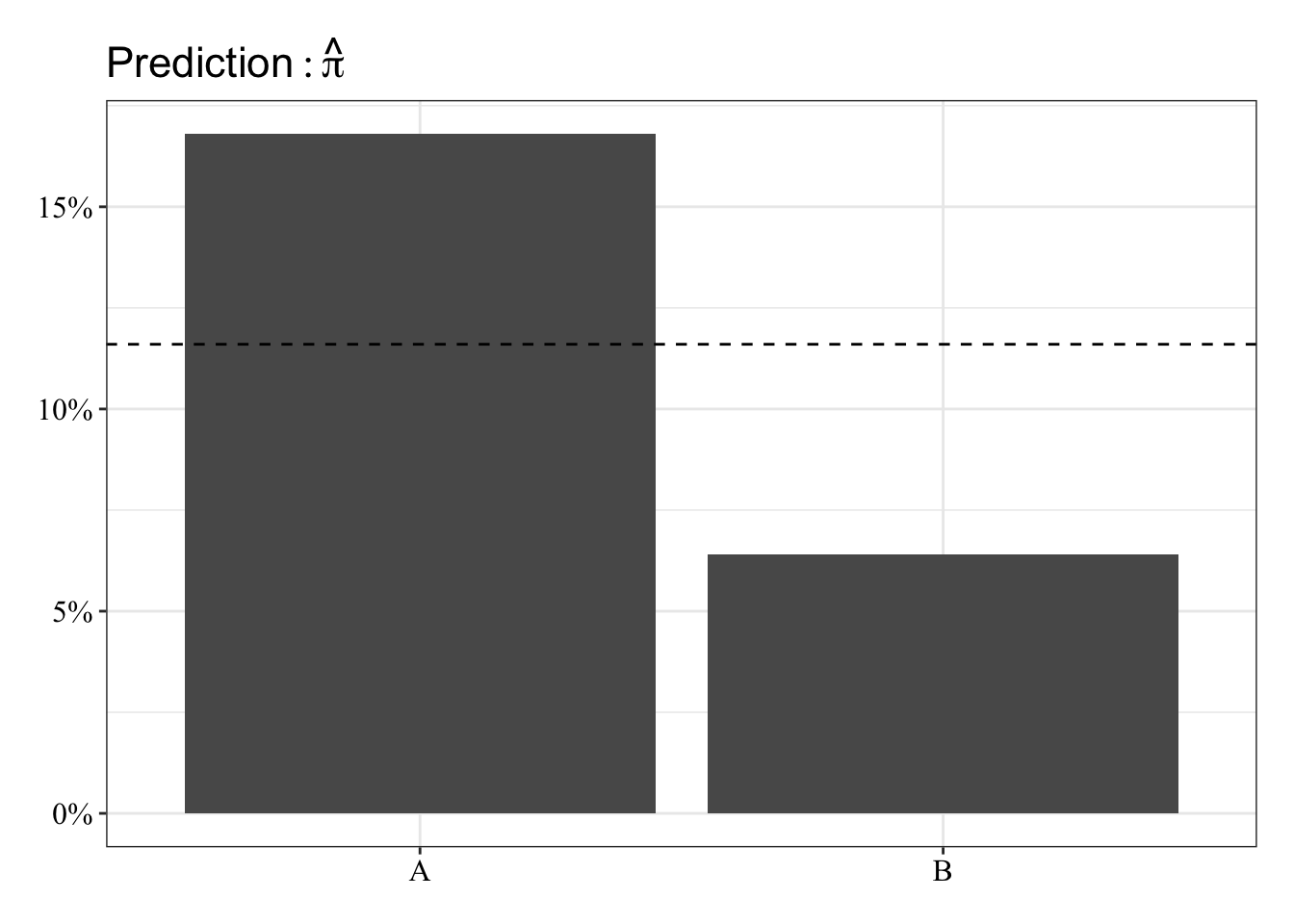
Fit linear regression
glm.fit3 <- glm(y ~ x1, family = gaussian(link = "identity"), data = data2)Results Summary
When \(x_1\) equals 0 (i.e., exactly in between group A and B coded as -0.5 and 0.5), the model predicts a 12% probability that Y equals 1. For every 1 unit change in \(x_1\) (i.e., “moving” from one group to another), the predicted probability that Y equals 1 decreases linearly by 10%.
summary(glm.fit3)##
## Call:
## glm(formula = y ~ x1, family = gaussian(link = "identity"), data = data2)
##
## Deviance Residuals:
## Min 1Q Median 3Q Max
## -0.168 -0.168 -0.064 -0.064 0.936
##
## Coefficients:
## Estimate Std. Error t value Pr(>|t|)
## (Intercept) 0.11600 0.02006 5.781 2.22e-08 ***
## x1 -0.10400 0.04013 -2.592 0.0101 *
## ---
## Signif. codes: 0 '***' 0.001 '**' 0.01 '*' 0.05 '.' 0.1 ' ' 1
##
## (Dispersion parameter for gaussian family taken to be 0.1006452)
##
## Null deviance: 25.636 on 249 degrees of freedom
## Residual deviance: 24.960 on 248 degrees of freedom
## AIC: 139.42
##
## Number of Fisher Scoring iterations: 2Receiver Operating Characteristic Curve
The area under the receiver operating characteristic curve is 0.63, which means that 63% of the time the model is expected to decide that a random Y = 1 is indeed a 1 (true positive) instead of deciding a random Y = 0 is a 1 (false positive). Think of this is a measure of diagnosticity: How often is the model expected to correctly diagnose Y = 1 observations rather than incorrectly diagnose Y = 0 observations. This AUROC value is neither perfect (AUROC = 100%) nor consistent with chance diagnosticity (AUROC = 50%).
# Wrapping () around the code below allows me to save and print the results together
(roc.fit3 <- roc(response = glm.fit3$data$y, predictor = glm.fit3$fitted.values, direction = "<", plot = TRUE, ci = TRUE, ci.method = "boot", boot.n = 1000))
## Setting levels: control = 0, case = 1
##
## Call:
## roc.default(response = glm.fit3$data$y, predictor = glm.fit3$fitted.values,     direction = "<", ci = TRUE, plot = TRUE, ci.method = "boot",     boot.n = 1000)
##
## Data: glm.fit3$fitted.values in 221 controls (glm.fit3$data$y 0) < 29 cases (glm.fit3$data$y 1).
## Area under the curve: 0.6268
## 95% CI: 0.5405-0.7161 (1000 stratified bootstrap replicates)
# sensitivity = true positive rate and specificity = 1 - false negative rate = true negative rate
tibble(sensitivity = roc.fit3$sensitivities, specificity = roc.fit3$specificities, false_positive = 1 - specificity) %>%
ggplot(mapping = aes(x = false_positive, y = sensitivity)) +
geom_line() +
geom_area(alpha = 0.25, position = "identity") +
geom_abline(intercept = 0, slope = 1, linetype = "dashed") +
scale_x_continuous(breaks = seq(0, 1, 0.20), labels = percent_format(accuracy = 1)) +
scale_y_continuous(breaks = seq(0, 1, 0.20), labels = percent_format(accuracy = 1)) +
labs(x = "False Positive Rate", y = "Sensitivity (True Positive Rate)") +
post_theme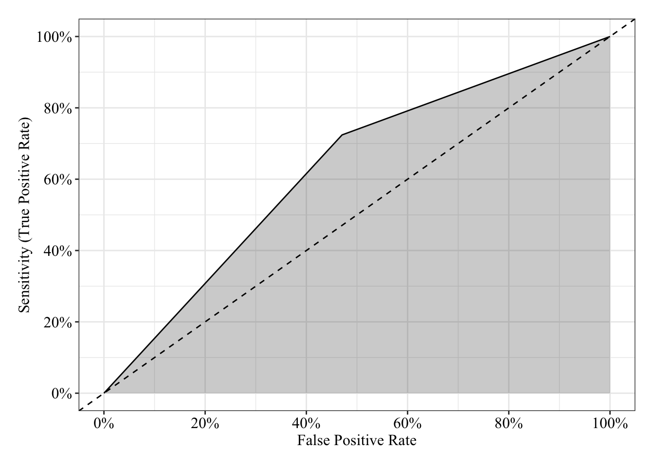
Fit logistic regression
glm.fit4 <- glm(y ~ x1, family = binomial(link = "logit"), data = data2)Results Summary
summary(glm.fit4)##
## Call:
## glm(formula = y ~ x1, family = binomial(link = "logit"), data = data2)
##
## Deviance Residuals:
## Min 1Q Median 3Q Max
## -0.6065 -0.6065 -0.3637 -0.3637 2.3447
##
## Coefficients:
## Estimate Std. Error z value Pr(>|z|)
## (Intercept) -2.1413 0.2184 -9.805 <2e-16 ***
## x1 -1.0829 0.4368 -2.479 0.0132 *
## ---
## Signif. codes: 0 '***' 0.001 '**' 0.01 '*' 0.05 '.' 0.1 ' ' 1
##
## (Dispersion parameter for binomial family taken to be 1)
##
## Null deviance: 179.44 on 249 degrees of freedom
## Residual deviance: 172.63 on 248 degrees of freedom
## AIC: 176.63
##
## Number of Fisher Scoring iterations: 5Odds Ratios
When \(x_1\) equals 0 (i.e., exactly in between group A and B coded as -0.5 and 0.5), the odds that Y = 1 are 0.12, which means Y = 0 is 88% more likey than Y = 1. For every 1 unit change in \(x_1\) (i.e., “moving” from one group to another), the odds that Y = 1 decrease by 66% (OR = 0.34).
# exp() (see help("exp)) raises the base value to the given value (e.g., by default, it raises Euler's number to the value given). Raising Euler's number to the given log-odds (logit) is the odds: e^log-odds = odds
exp(coefficients(glm.fit4))
## (Intercept) x1
## 0.1175019 0.3386243Receiver Operating Characteristic Curve
The area under the receiver operating characteristic curve is 0.63, which means that 63% of the time the model is expected to decide that a random Y = 1 is indeed a 1 (true positive) instead of deciding a random Y = 0 is a 1 (false positive). Think of this is a measure of diagnosticity: How often is the model expected to correctly diagnose Y = 1 observations rather than incorrectly diagnose Y = 0 observations. This AUROC value is neither perfect (AUROC = 100%) nor consistent with chance diagnosticity (AUROC = 50%).
# Wrapping () around the code below allows me to save and print the results together
(roc.fit4 <- roc(response = glm.fit4$data$y, predictor = glm.fit4$fitted.values, direction = "<", plot = TRUE, ci = TRUE, ci.method = "boot", boot.n = 1000))
## Setting levels: control = 0, case = 1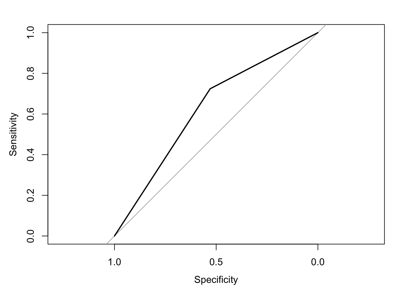
##
## Call:
## roc.default(response = glm.fit4$data$y, predictor = glm.fit4$fitted.values,     direction = "<", ci = TRUE, plot = TRUE, ci.method = "boot",     boot.n = 1000)
##
## Data: glm.fit4$fitted.values in 221 controls (glm.fit4$data$y 0) < 29 cases (glm.fit4$data$y 1).
## Area under the curve: 0.6268
## 95% CI: 0.5448-0.7079 (1000 stratified bootstrap replicates)
# sensitivity = true positive rate and specificity = 1 - false negative rate = true negative rate
tibble(sensitivity = roc.fit4$sensitivities, specificity = roc.fit4$specificities, false_positive = 1 - specificity) %>%
ggplot(mapping = aes(x = false_positive, y = sensitivity)) +
geom_line() +
geom_area(alpha = 0.25, position = "identity") +
geom_abline(intercept = 0, slope = 1, linetype = "dashed") +
scale_x_continuous(breaks = seq(0, 1, 0.20), labels = percent_format(accuracy = 1)) +
scale_y_continuous(breaks = seq(0, 1, 0.20), labels = percent_format(accuracy = 1)) +
labs(x = "False Positive Rate", y = "Sensitivity (True Positive Rate)") +
post_theme
Multiple Logistic Regression Model: 2 Quantitative Predictors
\(\log_e(\frac{\pi}{1 - \pi}) = \beta_0 + \beta_1x_1 + \beta_2x_2\)
Generate data
Save parameters
- Sample Size = 250
- \(\beta_0\) (the intercept) = 0
- \(\beta_1\) = 1
- \(\beta_2\) = 1
N <- 250
b0 <- 0
b1 <- 1
b2 <- 1
Sample predictors (Normal distribution)
\(X_1 \sim \mathcal{N}(\mu, \sigma^2) = \mathcal{N}(0, 1)\)
\(X_2 \sim \mathcal{N}(\mu, \sigma^2) = \mathcal{N}(0, 1)\)
# Set random seed so results can be reproduced
set.seed(614513)

x1 <- rnorm(n = N, mean = 0, sd = 1)
x2 <- rnorm(n = N, mean = 0, sd = 1)
Generate data as a function of model (Binomial Distribution)
\(\mathcal{B}(n, \pi) = \mathcal{B}(1, \pi)\)
# Set random seed so results can be reproduced
set.seed(614513)

# The prob argument asks for the probability of 1 for each replicate, which is a logistic function of the additive, linear equation
y <- rbinom(n = N, size = 1, prob = plogis(b0 + b1 * x1 + b2 * x2))
Table data
data3 <- tibble(id = 1:N, y, x1, x2)

data3 %>%
  head() %>%
  kable() %>%
kable_styling(bootstrap_options = c("striped", "hover"))| id | y | x1 | x2 |
|---|---|---|---|
| 1 | 1 | -0.0125840 | 0.7755981 |
| 2 | 0 | -0.7546030 | -1.3967041 |
| 3 | 0 | -1.3462009 | 1.1638134 |
| 4 | 0 | 0.4216914 | -1.4916297 |
| 5 | 1 | -1.3765932 | 1.6608769 |
| 6 | 1 | 0.0447956 | -0.0339239 |
Fit linear regression
glm.fit5 <- glm(y ~ x1 + x2, family = gaussian(link = "identity"), data = data3)Plot residuals
Below I’ve plotted the residuals against the predicted probabilities (\(\pi\) or pihat) as well as the observed values for each predictor, \(x_1\) and \(x_2\). Impossible values are colored orange and possible values are colored black The black loess line is not straight in any of the 3 plots, which suggests some relationship between residuals and predicted probabilities or between residuals and each predictor. These patterns could be spurious too.
# Save a data frame with residuals and fitted values (pihat)
pihat_residual3 <- tibble(model_form = "Linear",
                           x1 = glm.fit5$data$x1,
                           x2 = glm.fit5$data$x2,
                           pihat = glm.fit5$fitted.values,
                           residual = residuals.glm(glm.fit5, type = "response"))

# Plot fitted values (pihat) and residuals
pihat_residual3 %>%
  mutate(impossible = ifelse(pihat < 0 | pihat > 1, "Impossible Value", "Possible Value")) %>%
  gather(key = predictor, value = value, x1, x2, pihat) %>%
  ggplot(mapping = aes(x = value, y = residual)) +
  geom_hline(yintercept = 0, linetype = "dashed") +
  geom_smooth(method = "loess", se = FALSE, span = 0.80, color = "black") +
  geom_point(mapping = aes(color = impossible), size = 3, alpha = 0.50) +
  scale_y_continuous(breaks = seq(-1, 1, 0.25), labels = percent_format(accuracy = 1)) +
  scale_color_manual(values = c("#e69f00", "#000000")) +
  facet_wrap(facets = ~ predictor, scales = "free_x") +
  labs(x = NULL, y = expression(Residual: y - hat(pi)), color = NULL) +
  post_theme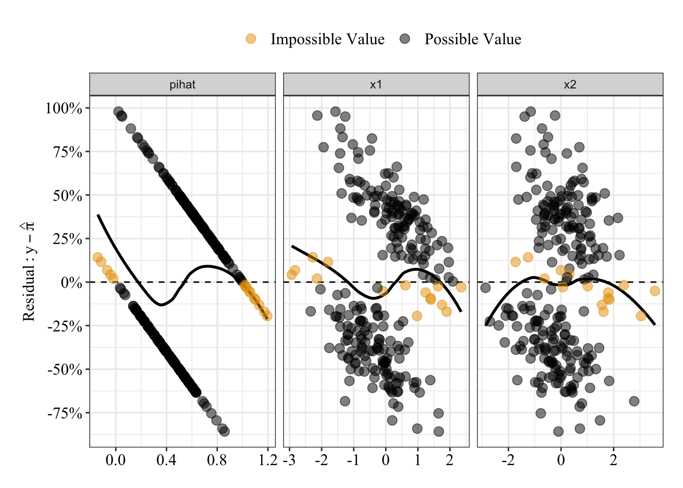
Results Summary
When \(x_1\) and \(x_2\) both equal 0, the model predicts a 53% probability that Y equals 1. For every 1 unit change in \(x_1\), the predicted probability that Y equals 1 increases linearly by 21%; for every 1 unit change in \(x_2\), the predicted probability that Y equals 1 increases linearly by 15%.
summary(glm.fit5)##
## Call:
## glm(formula = y ~ x1 + x2, family = gaussian(link = "identity"),
## data = data3)
##
## Deviance Residuals:
## Min 1Q Median 3Q Max
## -0.85792 -0.38154 -0.02654 0.37938 0.97891
##
## Coefficients:
## Estimate Std. Error t value Pr(>|t|)
## (Intercept) 0.52600 0.02742 19.18 < 2e-16 ***
## x1 0.20969 0.02807 7.47 1.38e-12 ***
## x2 0.15265 0.02707 5.64 4.64e-08 ***
## ---
## Signif. codes: 0 '***' 0.001 '**' 0.01 '*' 0.05 '.' 0.1 ' ' 1
##
## (Dispersion parameter for gaussian family taken to be 0.1872653)
##
## Null deviance: 62.464 on 249 degrees of freedom
## Residual deviance: 46.255 on 247 degrees of freedom
## AIC: 295.64
##
## Number of Fisher Scoring iterations: 2Receiver Operating Characteristic Curve
The area under the receiver operating characteristic curve is 0.81, which means that 81% of the time the model is expected to decide that a random Y = 1 is indeed a 1 (true positive) instead of deciding a random Y = 0 is a 1 (false positive). Think of this is a measure of diagnosticity: How often is the model expected to correctly diagnose Y = 1 observations rather than incorrectly diagnose Y = 0 observations. This AUROC value is neither perfect (AUROC = 100%) nor consistent with chance diagnosticity (AUROC = 50%).
# Wrapping () around the code below allows me to save and print the results together
(roc.fit5 <- roc(response = glm.fit5$data$y, predictor = glm.fit5$fitted.values, direction = "<", plot = TRUE, ci = TRUE, ci.method = "boot", boot.n = 1000))
## Setting levels: control = 0, case = 1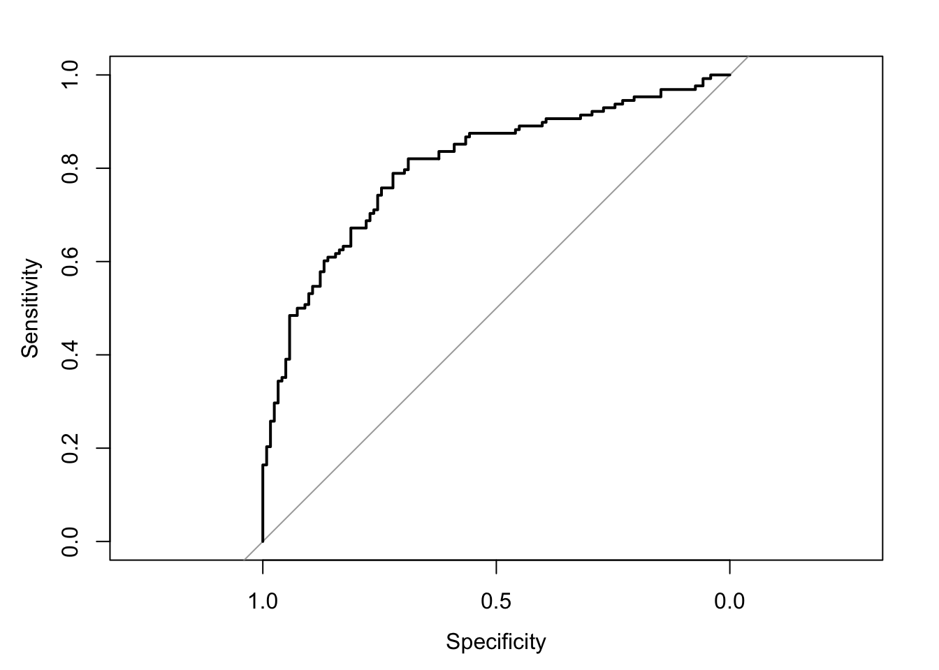
##
## Call:
## roc.default(response = glm.fit5$data$y, predictor = glm.fit5$fitted.values,     direction = "<", ci = TRUE, plot = TRUE, ci.method = "boot",     boot.n = 1000)
##
## Data: glm.fit5$fitted.values in 122 controls (glm.fit5$data$y 0) < 128 cases (glm.fit5$data$y 1).
## Area under the curve: 0.8068
## 95% CI: 0.7486-0.8571 (1000 stratified bootstrap replicates)
# sensitivity = true positive rate and specificity = 1 - false negative rate = true negative rate
tibble(sensitivity = roc.fit5$sensitivities, specificity = roc.fit5$specificities, false_positive = 1 - specificity) %>%
ggplot(mapping = aes(x = false_positive, y = sensitivity)) +
geom_line() +
geom_area(alpha = 0.25, position = "identity") +
geom_abline(intercept = 0, slope = 1, linetype = "dashed") +
scale_x_continuous(breaks = seq(0, 1, 0.20), labels = percent_format(accuracy = 1)) +
scale_y_continuous(breaks = seq(0, 1, 0.20), labels = percent_format(accuracy = 1)) +
labs(x = "False Positive Rate", y = "Sensitivity (True Positive Rate)") +
post_theme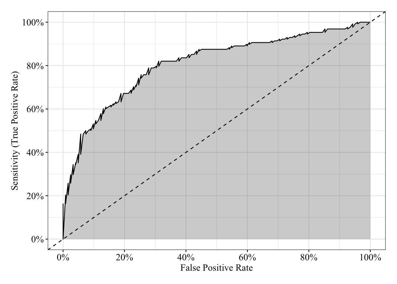
Fit logistic regression
glm.fit6 <- glm(y ~ x1 + x2, family = binomial(link = "logit"), data = data3)Plot residuals
Below I’ve plotted residuals from both the linear (red/orange) and logistic (blue) models against their predicted probabilities and two separate predictors (\(x_1\) and \(x_2\)). Based on the loess lines, both model seem to make similar patterns of errors (though remember that logistic predictions are bounded between 0% and 100%).
# Save a data frame with residuals and fitted values (pihat)
pihat_residual4 <- tibble(model_form = "Logistic",
                           x1 = glm.fit6$data$x1,
                           x2 = glm.fit6$data$x2,
                           pihat = glm.fit6$fitted.values,
                           residual = residuals.glm(glm.fit6, type = "response"))

# Plot fitted values (pihat) and residuals from both linear and logistic models
pihat_residual3 %>%
  bind_rows(pihat_residual4) %>%
  gather(key = predictor, value = value, x1, x2, pihat) %>%
  ggplot(mapping = aes(x = value, y = residual, color = model_form)) +
  geom_hline(yintercept = 0, linetype = "dashed") +
  geom_smooth(method = "loess", se = FALSE, span = 0.80) +
  geom_point(size = 3, alpha = 0.50) +
  scale_y_continuous(breaks = seq(-1, 1, 0.25), labels = percent_format(accuracy = 1)) +
  scale_color_manual(values = c("#d55e00", "#0072b2")) +
  facet_wrap(facets = ~ predictor, scales = "free_x") +
  labs(x = NULL, y = expression(Residual: y - hat(pi)), color = "Model Form") +
  post_theme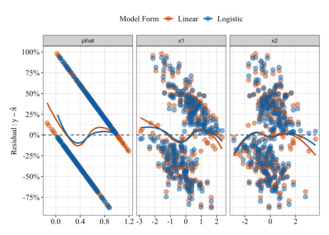
Results Summary
summary(glm.fit6)##
## Call:
## glm(formula = y ~ x1 + x2, family = binomial(link = "logit"),
## data = data3)
##
## Deviance Residuals:
## Min 1Q Median 3Q Max
## -2.0521 -0.9226 0.2534 0.9099 2.3265
##
## Coefficients:
## Estimate Std. Error z value Pr(>|z|)
## (Intercept) 0.1553 0.1491 1.042 0.298
## x1 1.1512 0.1873 6.145 8.01e-10 ***
## x2 0.8560 0.1715 4.991 6.00e-07 ***
## ---
## Signif. codes: 0 '***' 0.001 '**' 0.01 '*' 0.05 '.' 0.1 ' ' 1
##
## (Dispersion parameter for binomial family taken to be 1)
##
## Null deviance: 346.43 on 249 degrees of freedom
## Residual deviance: 270.82 on 247 degrees of freedom
## AIC: 276.82
##
## Number of Fisher Scoring iterations: 4Odds Ratios
When \(x_1\) and \(x_2\) both equal 0, the odds that Y = 1 are 1.17, which means Y = 1 is 17% more likey than Y = 0. For every 1 unit change in \(x_1\), the odds that Y = 1 increase by 216% (OR = 3.16); for every 1 unit change in \(x_2\), the odds that Y = 1 increase by 135% (OR = 2.35).
# exp() (see help("exp)) raises the base value to the given value (e.g., by default, it raises Euler's number to the value given). Raising Euler's number to the given log-odds (logit) is the odds: e^log-odds = odds
exp(coefficients(glm.fit6))
## (Intercept) x1 x2
## 1.168002 3.161864 2.353724Receiver Operating Characteristic Curve
The area under the receiver operating characteristic curve is 0.81, which means that 81% of the time the model is expected to decide that a random Y = 1 is indeed a 1 (true positive) instead of deciding a random Y = 0 is a 1 (false positive). Think of this is a measure of diagnosticity: How often is the model expected to correctly diagnose Y = 1 observations rather than incorrectly diagnose Y = 0 observations. This AUROC value is neither perfect (AUROC = 100%) nor consistent with chance diagnosticity (AUROC = 50%).
# Wrapping () around the code below allows me to save and print the results together
(roc.fit6 <- roc(response = glm.fit6$data$y, predictor = glm.fit6$fitted.values, direction = "<", plot = TRUE, ci = TRUE, ci.method = "boot", boot.n = 1000))
## Setting levels: control = 0, case = 1
##
## Call:
## roc.default(response = glm.fit6$data$y, predictor = glm.fit6$fitted.values,     direction = "<", ci = TRUE, plot = TRUE, ci.method = "boot",     boot.n = 1000)
##
## Data: glm.fit6$fitted.values in 122 controls (glm.fit6$data$y 0) < 128 cases (glm.fit6$data$y 1).
## Area under the curve: 0.8066
## 95% CI: 0.7524-0.8614 (1000 stratified bootstrap replicates)
# sensitivity = true positive rate and specificity = 1 - false negative rate = true negative rate
tibble(sensitivity = roc.fit6$sensitivities, specificity = roc.fit6$specificities, false_positive = 1 - specificity) %>%
ggplot(mapping = aes(x = false_positive, y = sensitivity)) +
geom_line() +
geom_area(alpha = 0.25, position = "identity") +
geom_abline(intercept = 0, slope = 1, linetype = "dashed") +
scale_x_continuous(breaks = seq(0, 1, 0.20), labels = percent_format(accuracy = 1)) +
scale_y_continuous(breaks = seq(0, 1, 0.20), labels = percent_format(accuracy = 1)) +
labs(x = "False Positive Rate", y = "Sensitivity (True Positive Rate)") +
post_theme
Plot Response Surface
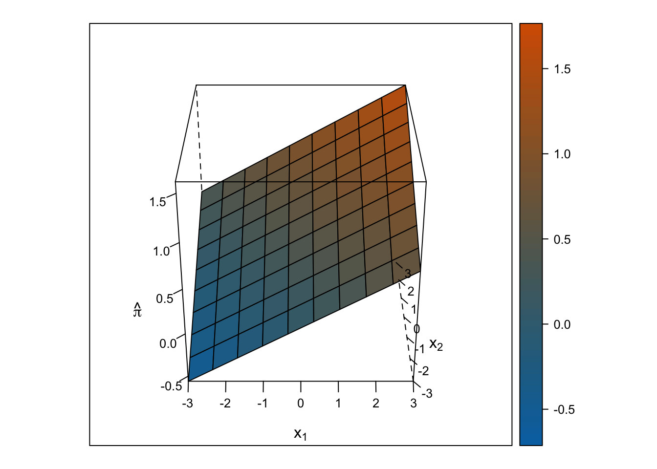
Linear Response Surface
The response surface from the multiple linear regression is a flat plane, so the slope for \(x_1\) is the same at all values for \(x_2\) and vice-versa.
# 35 positions for z axis rotation
for (i in seq(0, 350 , 10)) {
  print(
    expand.grid(x1 = seq(-3, 3, length.out = 10),
                x2 = seq(-3, 3, length.out = 10)) %>%
      mutate(pihat_linear = predict.glm(glm.fit5, newdata = data.frame(x1, x2), type = "response"),
             pihat_logistic = predict.glm(glm.fit6, newdata = data.frame(x1, x2), type = "response")) %>%
      wireframe(pihat_linear ~ x1 + x2, data = ., drape = TRUE, colorkey = TRUE, scales = list(arrows = FALSE), screen = list(z = i, x = -60), col.regions = colorRampPalette(c("#0072b2", "#d55e00"))(100), zlab = expression(hat(pi)), xlab = expression(x[1]), ylab = expression(x[2]))
  )
}
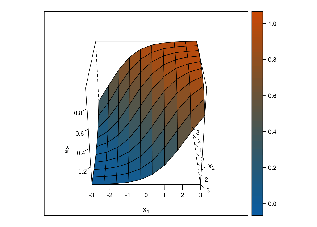
Logistic Response Surface
The response surface from the multiple logistic regression is S-shaped in both directions such that the surface looks like a piece of paper bent like an S from one corner of the cube to the other. Thus, the slope for \(x_1\) changes depending on the value of \(x_2\) and vice-versa.
# 35 positions for z axis rotation
for (i in seq(0, 350 , 10)) {
  print(
    expand.grid(x1 = seq(-3, 3, length.out = 10),
                x2 = seq(-3, 3, length.out = 10)) %>%
      mutate(pihat_linear = predict.glm(glm.fit5, newdata = data.frame(x1, x2), type = "response"),
             pihat_logistic = predict.glm(glm.fit6, newdata = data.frame(x1, x2), type = "response")) %>%
      wireframe(pihat_logistic ~ x1 + x2, data = ., drape = TRUE, colorkey = TRUE, scales = list(arrows = FALSE), screen = list(z = i, x = -60), col.regions = colorRampPalette(c("#0072b2", "#d55e00"))(100), zlab = expression(hat(pi)), xlab = expression(x[1]), ylab = expression(x[2]))
  )
}
Multiple Logistic Regression Model: 1 quantitative predictor with a quadratic trend
\(\log_e(\frac{\pi}{1 - \pi}) = \beta_0 + \beta_1x_1 + \beta_2x^2_1\)
Generate data
Save parameters
- Sample Size = 250
- \(\beta_0\) (the intercept) = 0
- \(\beta_1\) = 1
- \(\beta_2\) = 1
Save parameters
N <- 250
b0 <- 0
b1 <- 1
b2 <- 1
Sample predictors (Normal distribution)
\(X_1 \sim \mathcal{N}(\mu, \sigma^2) = \mathcal{N}(0, 1)\)
# Set random seed so results can be reproduced
set.seed(303786)

x1 <- rnorm(n = N, mean = 0, sd = 1)
Generate data as a function of model (Binomial Distribution)
\(\mathcal{B}(n, \pi) = \mathcal{B}(1, \pi)\)
# Set random seed so results can be reproduced
set.seed(303786)

# The prob argument asks for the probability of 1 for each replicate, which is a logistic function of the additive, linear equation
y <- rbinom(n = N, size = 1, prob = plogis(b0 + b1 * x1 + b2 * x1^2))
Table data
data4 <- tibble(id = 1:N, y, x1, x1_squared = x1^2)

data4 %>%
  head() %>%
  kable() %>%
kable_styling(bootstrap_options = c("striped", "hover"))| id | y | x1 | x1_squared |
|---|---|---|---|
| 1 | 1 | -1.0359267 | 1.0731441 |
| 2 | 1 | 0.0153472 | 0.0002355 |
| 3 | 1 | 0.1438260 | 0.0206859 |
| 4 | 1 | -0.3930759 | 0.1545087 |
| 5 | 1 | -0.2215981 | 0.0491057 |
| 6 | 1 | -0.9376051 | 0.8791033 |
Plot data
Linear and Logistic regressions (both with quadratic terms) make different predictions. The logistic regression (blue line) predictions follow an S-shape on both “sides” of \(x_1\), and those predictions fall between 0% and 100%. The predictions from linear regression follow a U-shape such that the slope is negative before \(x_1\) = 0 and positive after \(x_1\) = 0. But, the linear regression (red/orange line) makes some impossible predictions: The fit line makes predictions below 0% and above 100%.
data4 %>%
  ggplot(mapping = aes(x = x1, y = y)) +
  geom_hline(yintercept = 0, linetype = "dotted") +
  geom_hline(yintercept = 1, linetype = "dotted") +
  geom_smooth(mapping = aes(color = "Linear"), method = "glm", formula = y ~ poly(x, degree = 2), method.args = list(family = gaussian(link = "identity")), se = FALSE) +
  geom_smooth(mapping = aes(color = "Logistic"), method = "glm", formula = y ~ poly(x, degree = 2), method.args = list(family = binomial(link = "logit")), se = FALSE) +
  geom_point(size = 3, alpha = 0.50) +
  scale_y_continuous(breaks = seq(-2, 2, 0.20), labels = percent_format(accuracy = 1)) +
  scale_color_manual(values = c("#d55e00", "#0072b2")) +
  labs(x = expression(x[1]), y = NULL, title = bquote("Prediction:" ~ hat(pi)), color = "Model Form") +
  post_theme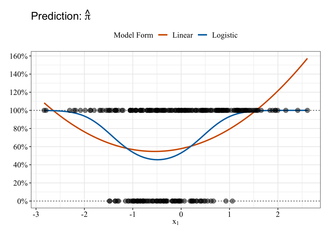
Fit linear regression
The stats::poly function (see help("poly")) creates orthogonal polynomial terms for you (e.g., linear, quadratic, cubic). This method scales the variables so that they are not correlated (predicted probabilities will be the same). Thus, you can interpret their independent effects in your regression (see this stackoverflow answer for more details).
glm.fit7 <- glm(y ~ poly(x1, degree = 2), family = gaussian(link = "identity"), data = data4)Plot residuals
Like before, possible predicted probabilities are black; impossible predicted probabilities are orange. There’s a pattern such that larger (and impossible) predicted probabilities have a negative relationship with residuals.
# Save a data frame with residuals and fitted values (pihat)
pihat_residual5 <- tibble(model_form = "Linear",
                          x1 = glm.fit7$data$x1,
                          x1_squared = glm.fit7$data$x1_squared,
                          pihat = glm.fit7$fitted.values,
                          residual = residuals.glm(glm.fit7, type = "response"))

# Plot fitted values (pihat) and residuals
pihat_residual5 %>%
  mutate(impossible = ifelse(pihat < 0 | pihat > 1, "Impossible Value", "Possible Value")) %>%
  gather(key = predictor, value = value, x1, x1_squared, pihat) %>%
  ggplot(mapping = aes(x = value, y = residual)) +
  geom_hline(yintercept = 0, linetype = "dashed") +
  geom_smooth(method = "loess", se = FALSE, span = 0.80, color = "black") +
  geom_point(mapping = aes(color = impossible), size = 3, alpha = 0.50) +
  scale_y_continuous(breaks = seq(-1, 1, 0.25), labels = percent_format(accuracy = 1)) +
  scale_color_manual(values = c("#e69f00", "#000000")) +
  facet_wrap(facets = ~ predictor, scales = "free_x") +
  labs(x = NULL, y = expression(Residual: y - hat(pi)), color = NULL) +
  post_theme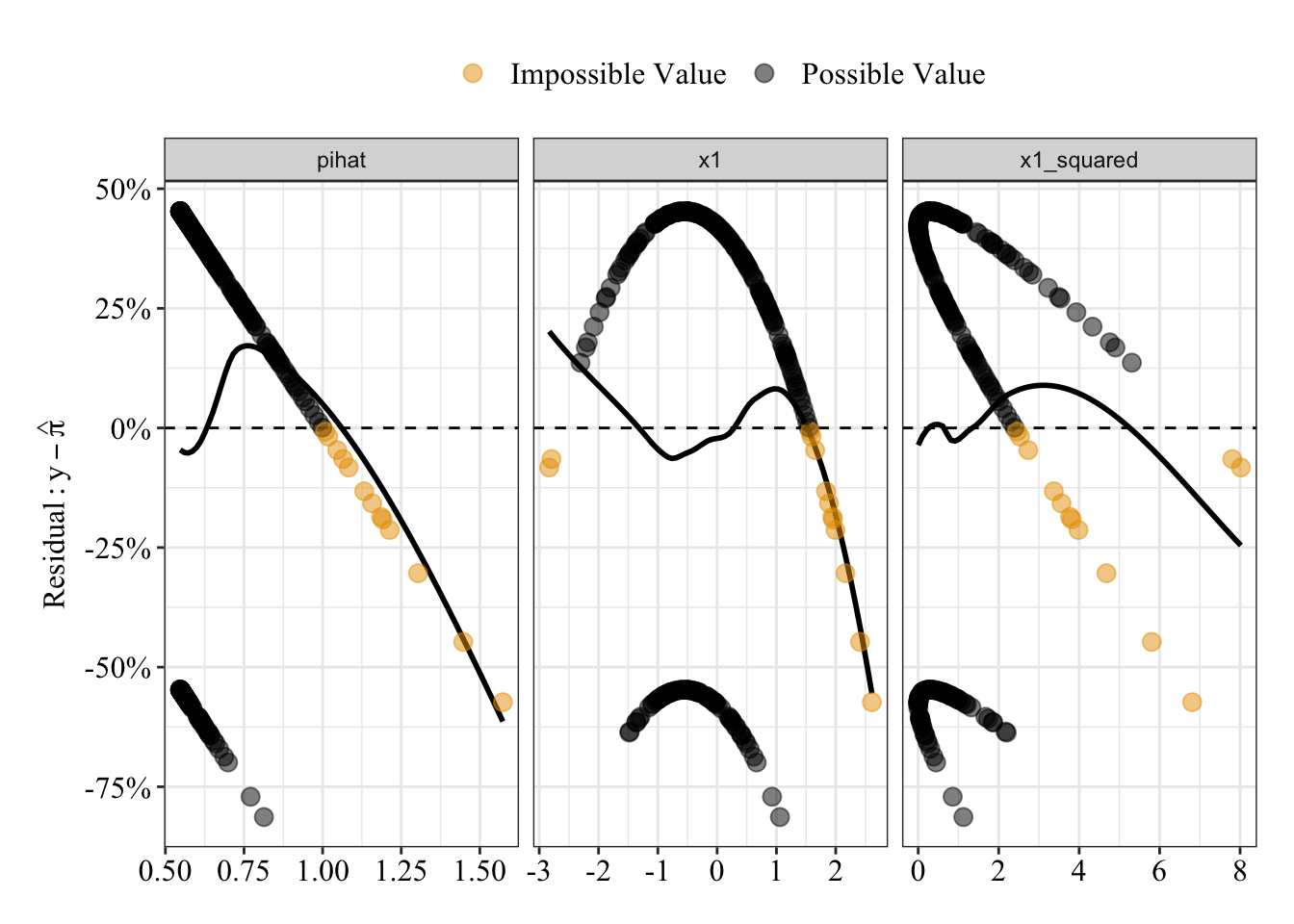
Results Summary
When \(x_1\) and \(x^2_1\) both equal 0, the model predicts a 67% probability that Y equals 1. For every 1 unit change in \(x_1\), the predicted probability that Y equals 1 increases linearly by 158%; for every 1 unit change in \(x^2_1\) (the quadratic term), the predicted probability that Y equals 1 increases linearly by 211% (the quadratic trend still has a linear interpretation). Thus, the relationship between \(x_1\) and Y depends on the value of \(x_1\) itself.
summary(glm.fit7)##
## Call:
## glm(formula = y ~ poly(x1, degree = 2), family = gaussian(link = "identity"),
## data = data4)
##
## Deviance Residuals:
## Min 1Q Median 3Q Max
## -0.8133 -0.5528 0.2123 0.4058 0.4529
##
## Coefficients:
## Estimate Std. Error t value Pr(>|t|)
## (Intercept) 0.66800 0.02802 23.837 < 2e-16 ***
## poly(x1, degree = 2)1 1.57514 0.44310 3.555 0.000453 ***
## poly(x1, degree = 2)2 2.11365 0.44310 4.770 3.15e-06 ***
## ---
## Signif. codes: 0 '***' 0.001 '**' 0.01 '*' 0.05 '.' 0.1 ' ' 1
##
## (Dispersion parameter for gaussian family taken to be 0.1963378)
##
## Null deviance: 55.444 on 249 degrees of freedom
## Residual deviance: 48.495 on 247 degrees of freedom
## AIC: 307.47
##
## Number of Fisher Scoring iterations: 2Receiver Operating Characteristic Curve
The area under the receiver operating characteristic curve is 0.73, which means that 73% of the time the model is expected to decide that a random Y = 1 is indeed a 1 (true positive) instead of deciding a random Y = 0 is a 1 (false positive). Think of this is a measure of diagnosticity: How often is the model expected to correctly diagnose Y = 1 observations rather than incorrectly diagnose Y = 0 observations. This AUROC value is neither perfect (AUROC = 100%) nor consistent with chance diagnosticity (AUROC = 50%).
# Wrapping () around the code below allows me to save and print the results together
(roc.fit7 <- roc(response = glm.fit7$data$y, predictor = glm.fit7$fitted.values, direction = "<", plot = TRUE, ci = TRUE, ci.method = "boot", boot.n = 1000))
## Setting levels: control = 0, case = 1
##
## Call:
## roc.default(response = glm.fit7$data$y, predictor = glm.fit7$fitted.values,     direction = "<", ci = TRUE, plot = TRUE, ci.method = "boot",     boot.n = 1000)
##
## Data: glm.fit7$fitted.values in 83 controls (glm.fit7$data$y 0) < 167 cases (glm.fit7$data$y 1).
## Area under the curve: 0.7266
## 95% CI: 0.662-0.7891 (1000 stratified bootstrap replicates)
# sensitivity = true positive rate and specificity = 1 - false negative rate = true negative rate
tibble(sensitivity = roc.fit7$sensitivities, specificity = roc.fit7$specificities, false_positive = 1 - specificity) %>%
ggplot(mapping = aes(x = false_positive, y = sensitivity)) +
geom_line() +
geom_area(alpha = 0.25, position = "identity") +
geom_abline(intercept = 0, slope = 1, linetype = "dashed") +
scale_x_continuous(breaks = seq(0, 1, 0.20), labels = percent_format(accuracy = 1)) +
scale_y_continuous(breaks = seq(0, 1, 0.20), labels = percent_format(accuracy = 1)) +
labs(x = "False Positive Rate", y = "Sensitivity (True Positive Rate)") +
post_theme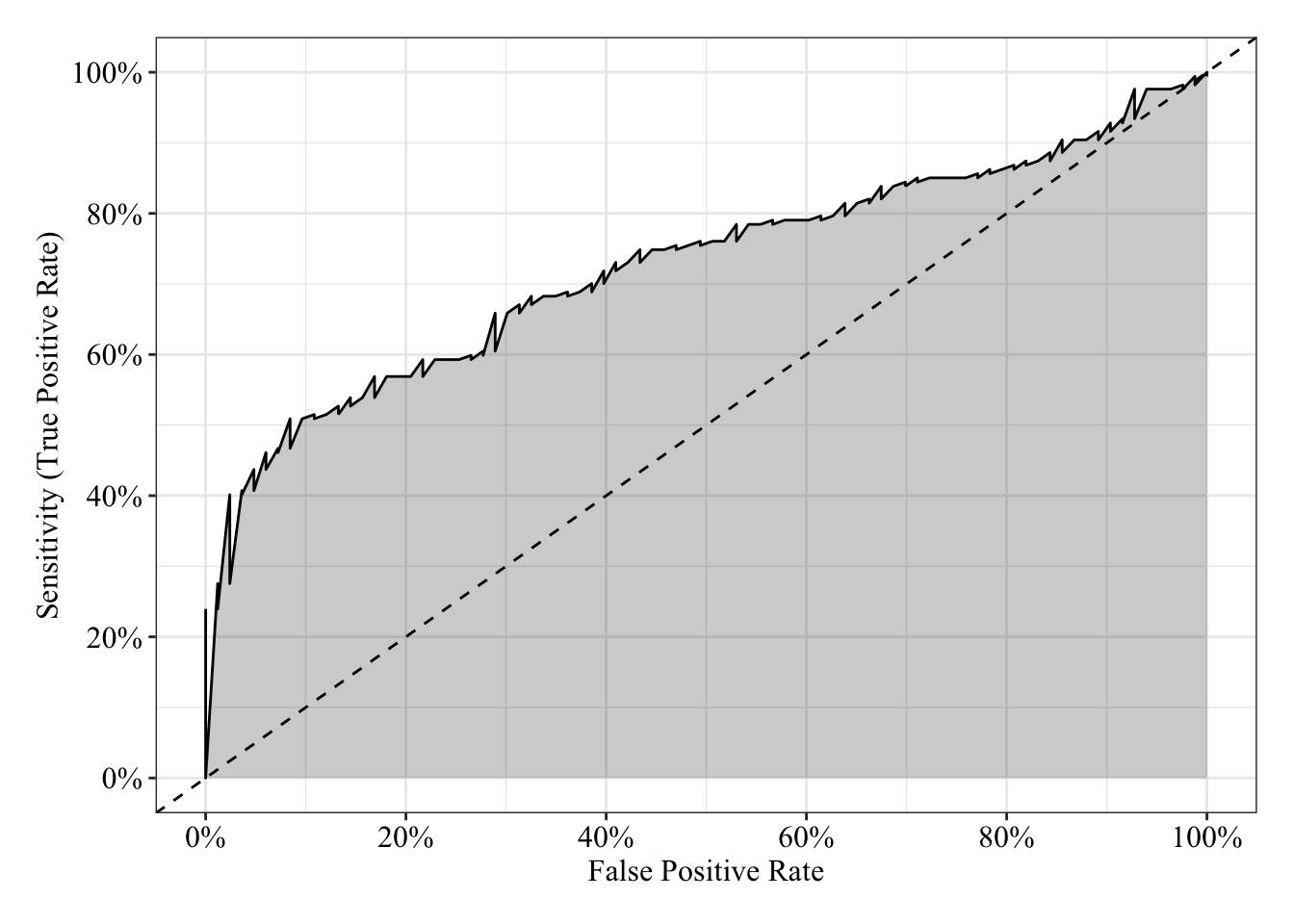
Fit logistic regression
glm.fit8 <- glm(y ~ poly(x1, degree = 2), family = binomial(link = "logit"), data = data4)Plot residuals
Compared to the predicted probabilities from the linear regression (red/orange), the logistic regression predicted probabilities (blue) share a much weaker, flatter relationship with the residuals (compare the loess lines in the far left panel).
# Save a data frame with residuals and fitted values (pihat)
pihat_residual6 <- tibble(model_form = "Logistic",
                          x1 = glm.fit8$data$x1,
                          x1_squared = glm.fit8$data$x1_squared,
                          pihat = glm.fit8$fitted.values,
                          residual = residuals.glm(glm.fit8, type = "response"))

# Plot fitted values (pihat) and residuals from both linear and logistic models
pihat_residual5 %>%
  bind_rows(pihat_residual6) %>%
  gather(key = predictor, value = value, x1, x1_squared, pihat) %>%
  ggplot(mapping = aes(x = value, y = residual, color = model_form)) +
  geom_hline(yintercept = 0, linetype = "dashed") +
  geom_smooth(method = "loess", se = FALSE, span = 0.80) +
  geom_point(size = 3, alpha = 0.50) +
  scale_y_continuous(breaks = seq(-1, 1, 0.25), labels = percent_format(accuracy = 1)) +
  scale_color_manual(values = c("#d55e00", "#0072b2")) +
  facet_wrap(facets = ~ predictor, scales = "free_x") +
  labs(x = NULL, y = expression(Residual: y - hat(pi)), color = "Model Form") +
  post_theme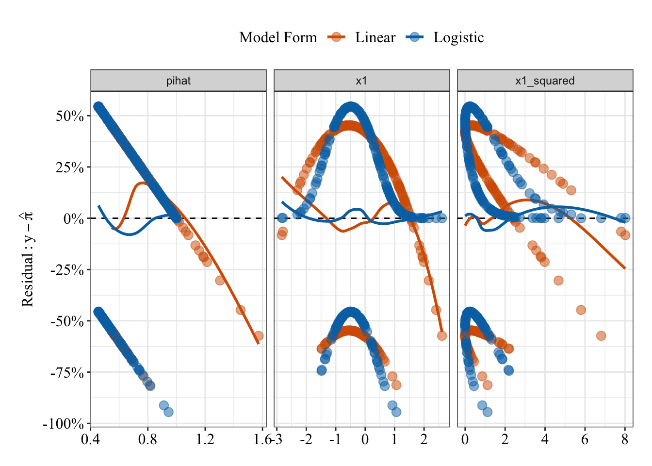
Results Summary
summary(glm.fit8)##
## Call:
## glm(formula = y ~ poly(x1, degree = 2), family = binomial(link = "logit"),
## data = data4)
##
## Deviance Residuals:
## Min 1Q Median 3Q Max
## -2.4076 -1.1266 0.3622 1.0384 1.2539
##
## Coefficients:
## Estimate Std. Error z value Pr(>|z|)
## (Intercept) 1.2394 0.2266 5.469 4.53e-08 ***
## poly(x1, degree = 2)1 16.9026 4.1688 4.055 5.02e-05 ***
## poly(x1, degree = 2)2 25.8887 5.6333 4.596 4.31e-06 ***
## ---
## Signif. codes: 0 '***' 0.001 '**' 0.01 '*' 0.05 '.' 0.1 ' ' 1
##
## (Dispersion parameter for binomial family taken to be 1)
##
## Null deviance: 317.79 on 249 degrees of freedom
## Residual deviance: 265.40 on 247 degrees of freedom
## AIC: 271.4
##
## Number of Fisher Scoring iterations: 6Odds Ratios
When \(x_1\) and \(x_2\) both equal 0, the odds that Y = 1 are 3.45, which means Y = 1 is 245% more likey than Y = 0. For every 1 unit change in \(x_1\), the odds that Y = 1 increase by 2.191300210^{9}% (OR = 2.191300310^{7}); for every 1 unit change in \(x_2\), the odds that Y = 1 increase by 1.75115810^{13}% (OR = 1.75115810^{11}).
# exp() (see help("exp)) raises the base value to the given value (e.g., by default, it raises Euler's number to the value given). Raising Euler's number to the given log-odds (logit) is the odds: e^log-odds = odds
exp(coefficients(glm.fit8))
## (Intercept) poly(x1, degree = 2)1 poly(x1, degree = 2)2
## 3.453437e+00 2.191300e+07 1.751158e+11Receiver Operating Characteristic Curve
The area under the receiver operating characteristic curve is 0.73, which means that 73% of the time the model is expected to decide that a random Y = 1 is indeed a 1 (true positive) instead of deciding a random Y = 0 is a 1 (false positive). Think of this is a measure of diagnosticity: How often is the model expected to correctly diagnose Y = 1 observations rather than incorrectly diagnose Y = 0 observations. This AUROC value is neither perfect (AUROC = 100%) nor consistent with chance diagnosticity (AUROC = 50%).
# Wrapping () around the code below allows me to save and print the results together
(roc.fit8 <- roc(response = glm.fit8$data$y, predictor = glm.fit8$fitted.values, direction = "<", plot = TRUE, ci = TRUE, ci.method = "boot", boot.n = 1000))
## Setting levels: control = 0, case = 1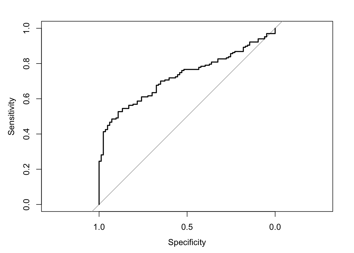
##
## Call:
## roc.default(response = glm.fit8$data$y, predictor = glm.fit8$fitted.values,     direction = "<", ci = TRUE, plot = TRUE, ci.method = "boot",     boot.n = 1000)
##
## Data: glm.fit8$fitted.values in 83 controls (glm.fit8$data$y 0) < 167 cases (glm.fit8$data$y 1).
## Area under the curve: 0.7256
## 95% CI: 0.6623-0.7878 (1000 stratified bootstrap replicates)
# sensitivity = true positive rate and specificity = 1 - false negative rate = true negative rate
tibble(sensitivity = roc.fit8$sensitivities, specificity = roc.fit8$specificities, false_positive = 1 - specificity) %>%
ggplot(mapping = aes(x = false_positive, y = sensitivity)) +
geom_line() +
geom_area(alpha = 0.25, position = "identity") +
geom_abline(intercept = 0, slope = 1, linetype = "dashed") +
scale_x_continuous(breaks = seq(0, 1, 0.20), labels = percent_format(accuracy = 1)) +
scale_y_continuous(breaks = seq(0, 1, 0.20), labels = percent_format(accuracy = 1)) +
labs(x = "False Positive Rate", y = "Sensitivity (True Positive Rate)") +
post_theme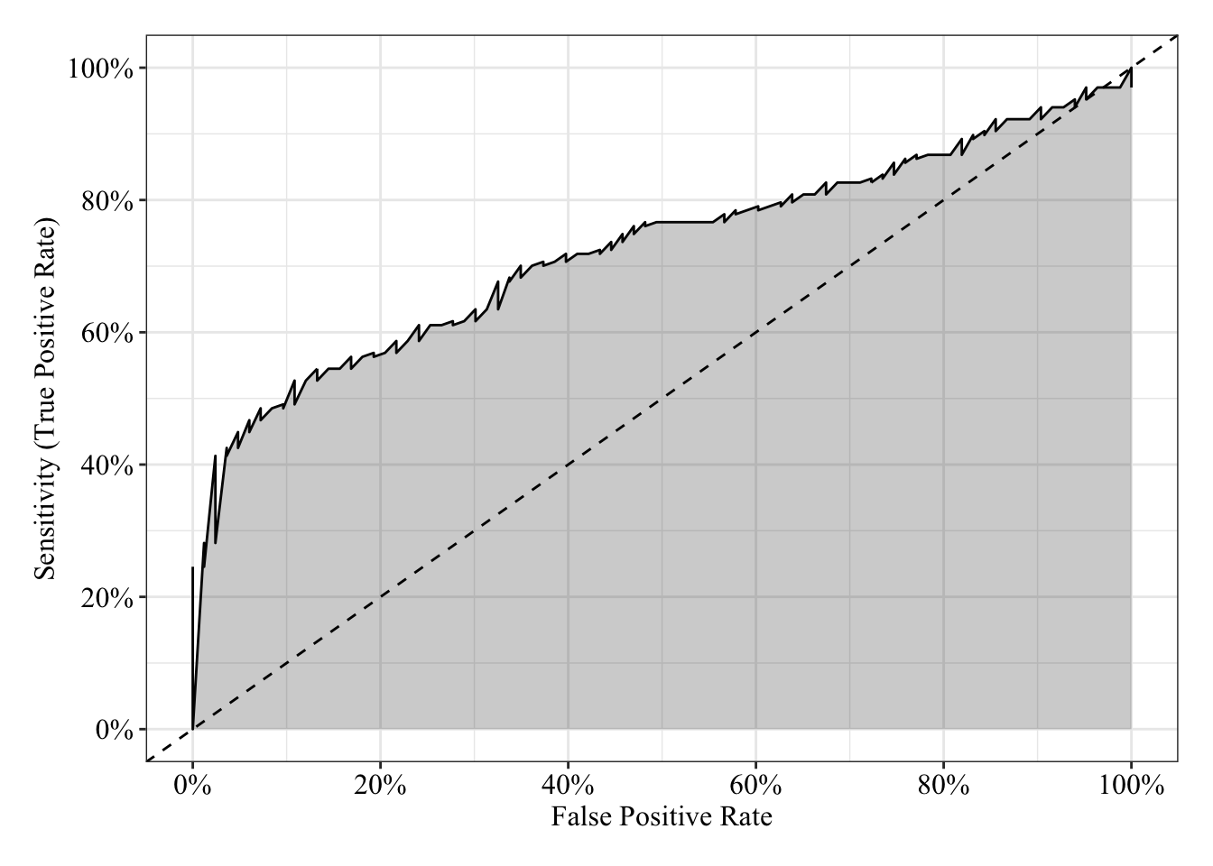
Plot Response Surface
Linear Response Surface
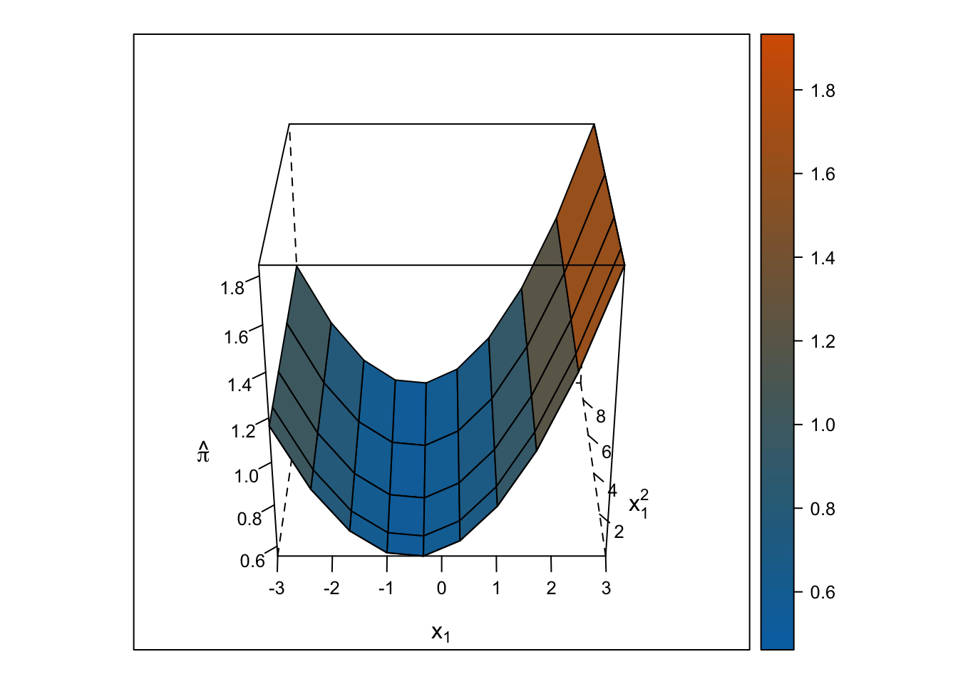
The response surface from the multiple linear regression is a U-shaped surface, so the slope for \(x_1\) depends on the value of \(x_2\) and vice-versa. Roughly, when \(x_1\) is below 0, the slope is negative, but when \(x_1\) is above 0, the slope is positive. Importantly, the U-shaped surface is not symmetrical: The slope past \(x_1\) = 0 “shoots” up beyond predicted probabilities = 100%.
# 35 positions for z axis rotation
for (i in seq(0, 350 , 10)) {
  print(
    expand.grid(x1 = seq(-3, 3, length.out = 10),
                x1_squared = seq(-3, 3, length.out = 10)^2) %>%
      mutate(pihat_linear = predict.glm(glm.fit7, newdata = data.frame(x1, x1_squared), type = "response"),
             pihat_logistic = predict.glm(glm.fit8, newdata = data.frame(x1, x1_squared), type = "response")) %>%
      wireframe(pihat_linear ~ x1 + x1_squared, data = ., drape = TRUE, colorkey = TRUE, scales = list(arrows = FALSE), screen = list(z = i, x = -60), col.regions = colorRampPalette(c("#0072b2", "#d55e00"))(100), zlab = expression(hat(pi)), xlab = expression(x[1]), ylab = expression(x[1]^2))
  )
}
Logistic Response Surface
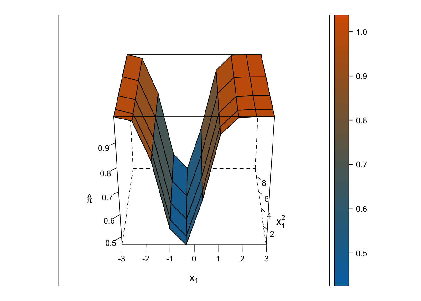
Unlike the smooth, U-shaped response surface from the multiple linear regression, the response surface from the logistic regression forms two S-shapes moving in opposite directions. Importantly, unlike with the linear regression response surface, the slope changes on either side of \(x_1\) = 0, and predicted probabilities are bounded by 0% and 100%.
# 35 positions for z axis rotation
for (i in seq(0, 350 , 10)) {
  print(
    expand.grid(x1 = seq(-3, 3, length.out = 10),
                x1_squared = seq(-3, 3, length.out = 10)^2) %>%
      mutate(pihat_linear = predict.glm(glm.fit7, newdata = data.frame(x1, x1_squared), type = "response"),
             pihat_logistic = predict.glm(glm.fit8, newdata = data.frame(x1, x1_squared), type = "response")) %>%
      wireframe(pihat_logistic ~ x1 + x1_squared, data = ., drape = TRUE, colorkey = TRUE, scales = list(arrows = FALSE), screen = list(z = i, x = -60), col.regions = colorRampPalette(c("#0072b2", "#d55e00"))(100), zlab = expression(hat(pi)), xlab = expression(x[1]), ylab = expression(x[1]^2))
  )
}
Resources
- Cohen, P., West, S. G., & Aiken, L. S. (2014). Applied multiple regression/correlation analysis for the behavioral sciences. Psychology Press.
- Kutner, M. H., Nachtsheim, C. J., Neter, J., & Li, W. (2005). Applied linear statistical models (Vol. 5). Boston: McGraw-Hill Irwin. [PDF] [Website]
- DECIPHERING INTERACTIONS IN LOGISTIC REGRESSION
- FAQ: HOW DO I INTERPRET ODDS RATIOS IN LOGISTIC REGRESSION?
General Word of Caution
Above, I listed resources prepared by experts on these and related topics. Although I generally do my best to write accurate posts, don’t assume my posts are 100% accurate or that they apply to your data or research questions. Trust statistics and methodology experts, not blog posts.
Nicholas M. Michalak
Data Scientist | Ph.D. Social Psychology
I study how both modern and evolutionarily-relevant threats affect how people perceive themselves and others.